Logos, colors, and typography usually have clearly defined rules in brand guidelines. Photography, however, is often overlooked, even though it takes up a significant amount of visual space on websites, social media, and in campaigns.
The result can be a mix of product shots, candid images, stock photography, and content from different campaigns. A consistent photography style should therefore be just as much a part of a brand’s visual identity as other visual elements.
What defines a brand’s photography style?
A photography style is about more than how an image is edited. It starts with deciding what is photographed and how.
The main elements to define include:
- subjects and settings – people, products, interiors, nature, or specific situations,
- composition – close-ups or wide shots, perspective, and the amount of negative space,
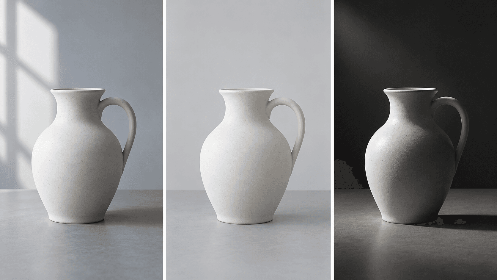
- lighting – natural, soft, high-contrast, or studio lighting,
- color palette – warm or cool tones, color intensity, and alignment with the brand’s color palette,
- post-production – contrast, saturation, retouching, grain, and other adjustments.
The goal is not to create a series of nearly identical images. It is to establish a recognizable visual style that works consistently across different formats.
Photography as part of brand guidelines
Photography rules can be included in brand guidelines alongside rules for logos, colors, and typography.
In addition to technical parameters, it is useful to define the overall character of the photography. Should the images feel natural, premium, energetic, minimalist, or perhaps documentary? This direction then influences the setting, lighting, and composition.
Specific examples of suitable and unsuitable images are also highly useful. The term “authentic photography” can be interpreted differently by different people, while a visual reference communicates the intended direction immediately.
Photo editing should follow a consistent approach
Consistency also applies to post-production. Differences in color temperature, contrast, or saturation can make images look disconnected when placed side by side.
A photography style can therefore define elements such as:
- warm or cool color tones,
- the level of contrast and saturation,
- the treatment of skin tones,
- the extent of retouching,
- the use of grain or other effects.
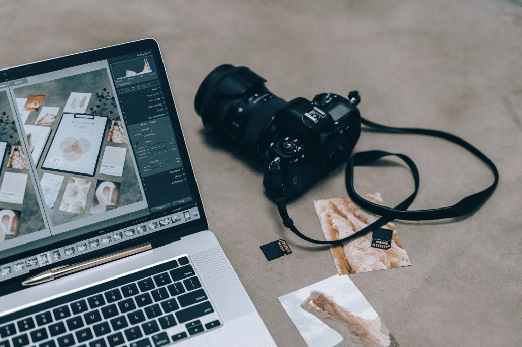
A preset alone, however, will not create a consistent style. If images are shot in different environments, lighting conditions, and compositions, applying the same color treatment will not eliminate those differences. Post-production should build on rules established when the images are created.
Original photography, stock images, and AI need the same rules
Original photography offers the greatest control over the final result. However, a consistent visual style can also be maintained when working with stock photography. The selection should follow the same parameters: lighting, color, composition, setting, and the character of the people or objects shown.
The same principle applies to AI-generated images. Without a defined visual direction, individual outputs can easily look as though they belong to several different brands. Photography guidelines can therefore also serve as a foundation for creating prompts and selecting generated visuals.
How to define photography guidelines
An audit of existing photography across the website, campaigns, social media, and other materials can be a useful starting point. It helps identify which elements already create consistency and where the biggest visual differences appear.
The photography section of brand guidelines should then include:
- the character and atmosphere of the photography,
- suitable subjects and settings,
- composition and lighting,
- color and post-production rules,
- recommended formats and crops,
- examples of appropriate and inappropriate use.
The rules should be specific enough for photographers, designers, and external agencies to follow, while still leaving room for different types of content.
From photography guidelines to asset management
Even a well-defined photography style will not be effective if approved images are scattered across drives, emails, and cloud folders. Managing visual identity therefore also requires a clear place for current, approved assets.
BrandCloud centralizes photography, logos, videos, and other brand materials while giving teams access to their approved versions. This means brand guidelines no longer need to be separated from the content they are designed to govern.
Instead of searching for the correct version of a file, teams have one place to manage and share current visual assets.
Photography shapes the character of a brand
A brand’s visual identity is not simply a collection of individual visual elements. What matters is how those elements work together.
In photography, this consistency comes primarily from a recurring approach to subjects, lighting, composition, color, and editing. A well-defined photography style helps preserve the character of a brand even when its logo is nowhere to be seen.