Wayfinding connects spatial orientation with information and graphic design. It helps people understand where they are, which way to go and how to recognise their destination. Signage, maps and the layout of the environment all contribute to it.
The designer’s task is to present this information clearly. What matters is how it is selected, ordered, positioned and connected.
Wayfinding starts with information structure
Before designing the graphics, establish what visitors need to learn at each location. An overview map requires different content from a directional sign at a junction.
When designing the system, you can group information by its purpose:
- Understanding the space: maps, floor plans and directories help people understand the layout of a building or site
- Following the route: directional signs show the way at points where people need to make a decision
- Confirming arrival: room, department or building signs help people recognise that they have reached their destination
This approach helps limit the amount of information on each sign. Every arrow does not need to be accompanied by a detailed list of all destinations.
Visual hierarchy guides attention
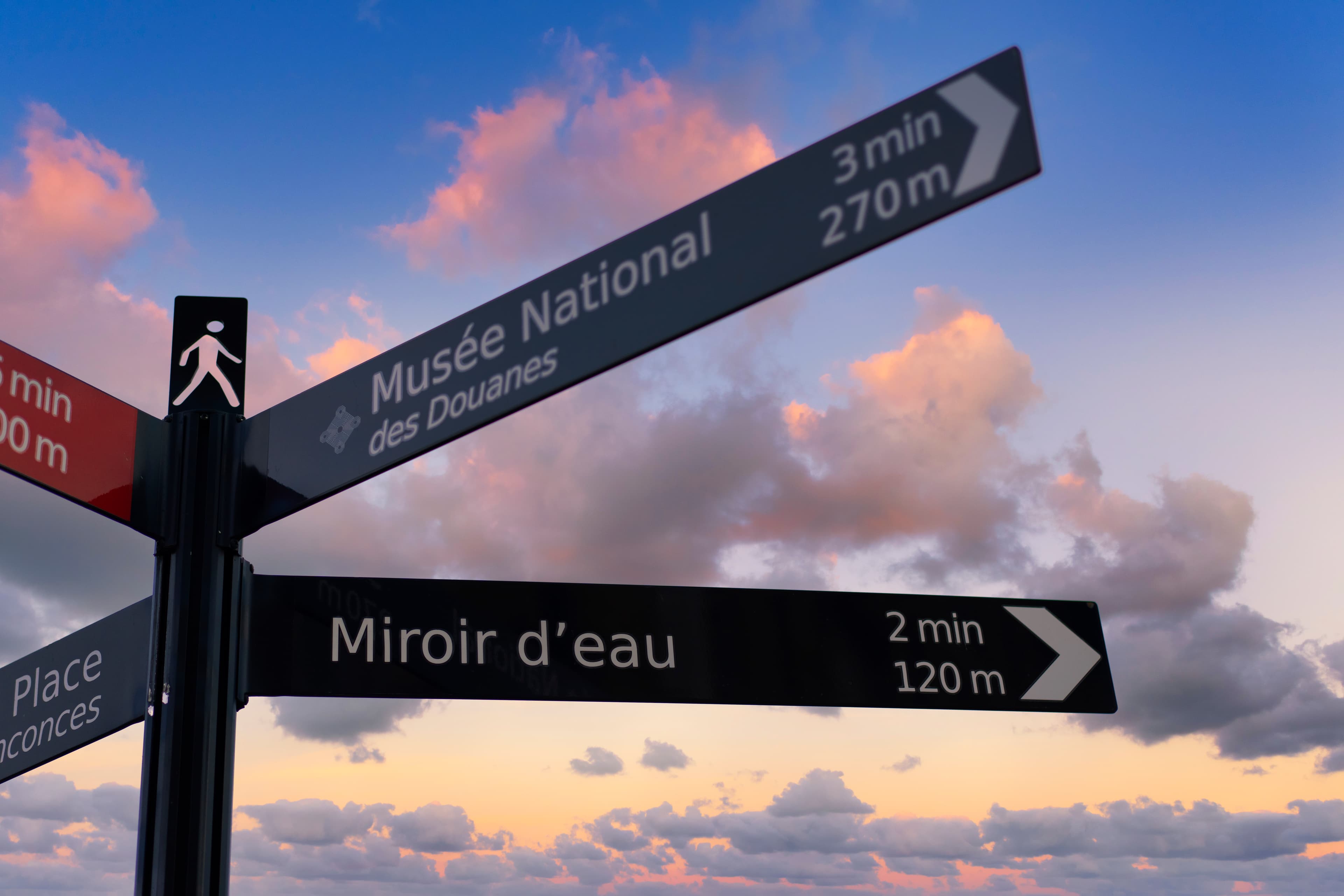
The layout should make it clear what to read first and which pieces of information belong together. Type size, weight, spacing and alignment all help achieve this.
A building name may need greater prominence than a floor or room label. Spacing between groups helps separate destinations in different directions. Each arrow must also be clearly associated with the relevant text.
A consistent layout makes subsequent signs easier to read. Visitors gradually learn where to look for directions and where to find supporting information.
Legibility must be assessed in the space
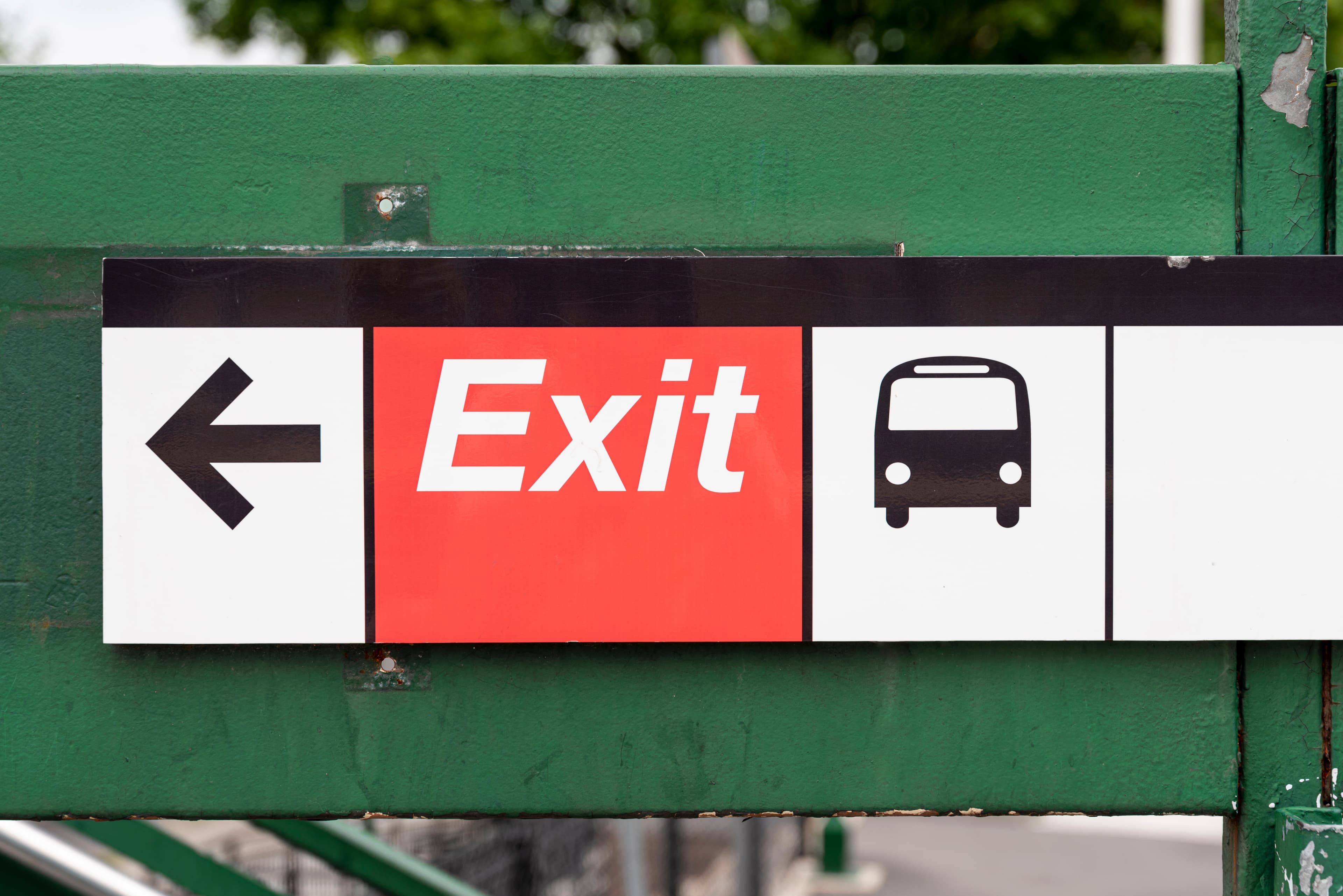
The size and design of signage must suit the viewing distance, lighting and how people move through the space. Typography therefore needs clearly distinguishable characters and sufficient contrast with the background. Materials and surface reflections also affect the result.
Colours can divide a space into zones. Their meaning should remain consistent and be supported by text, numbers or symbols. Navigation then does not depend solely on distinguishing colours.
Pictograms need a consistent visual style and a clear meaning. For common facilities, familiar symbols provide a useful starting point. Highly stylised designs can make them harder to understand.
Visual identity can extend into the space
Wayfinding graphics can reflect a brand’s character through colour, typography and shape. One example is dn&co’s design for the Here East campus in London.
Inspired by electrical diagrams, the system used orange lines on floors and walls alongside bold symbols. This visual language reflected the site’s technological focus while guiding visitors.
Translating an identity into a physical space requires its own design decisions. A typeface suited to advertising headlines may not work equally well on a directional sign viewed from a distance.
Brand guidelines should also cover wayfinding
A visual identity manual should explain how the brand is applied to a wayfinding system. Alongside the appearance of individual elements, it needs to define their relationships and permitted adaptations.
In BrandCloud, a wayfinding manual can extend the usual identity guidelines to cover specific applications in physical spaces. It can specify an alternative typeface for signage, the meaning of colour-coded zones or the layout of directional signs. Examples should also show when legibility takes priority over the usual advertising style.
Designers then have clear guidance on preserving the brand’s character while creating effective wayfinding.
How to test a wayfinding design
The design needs to be assessed at full size and along the entire route. A visualisation of an individual sign will not reveal whether the information forms a coherent sequence.
- Check the size: assess text and symbols from the distance at which they will actually be read
- Check the placement: examine whether signs are visible before turns and other decision points
- Use consistent terminology: use the same destination names on maps, directional signs and doors
- Test the route: involve someone unfamiliar with the space and record where they hesitate
A graphic system that works as a whole
The quality of wayfinding depends on how well its individual parts work together. Legible typography, understandable symbols and thoughtful placement give graphic design a practical purpose. The result is a space visitors can navigate with confidence.