A typeface that looks good in a large headline can become difficult to read when reduced in size. Fine strokes disappear, spacing seems tighter and individual characters become harder to distinguish. Yet it is still the same typeface.
This is where optical sizes come in. Slightly different letterforms are designed for smaller and larger text to better suit how people perceive them at each size.
What are optical sizes in typography
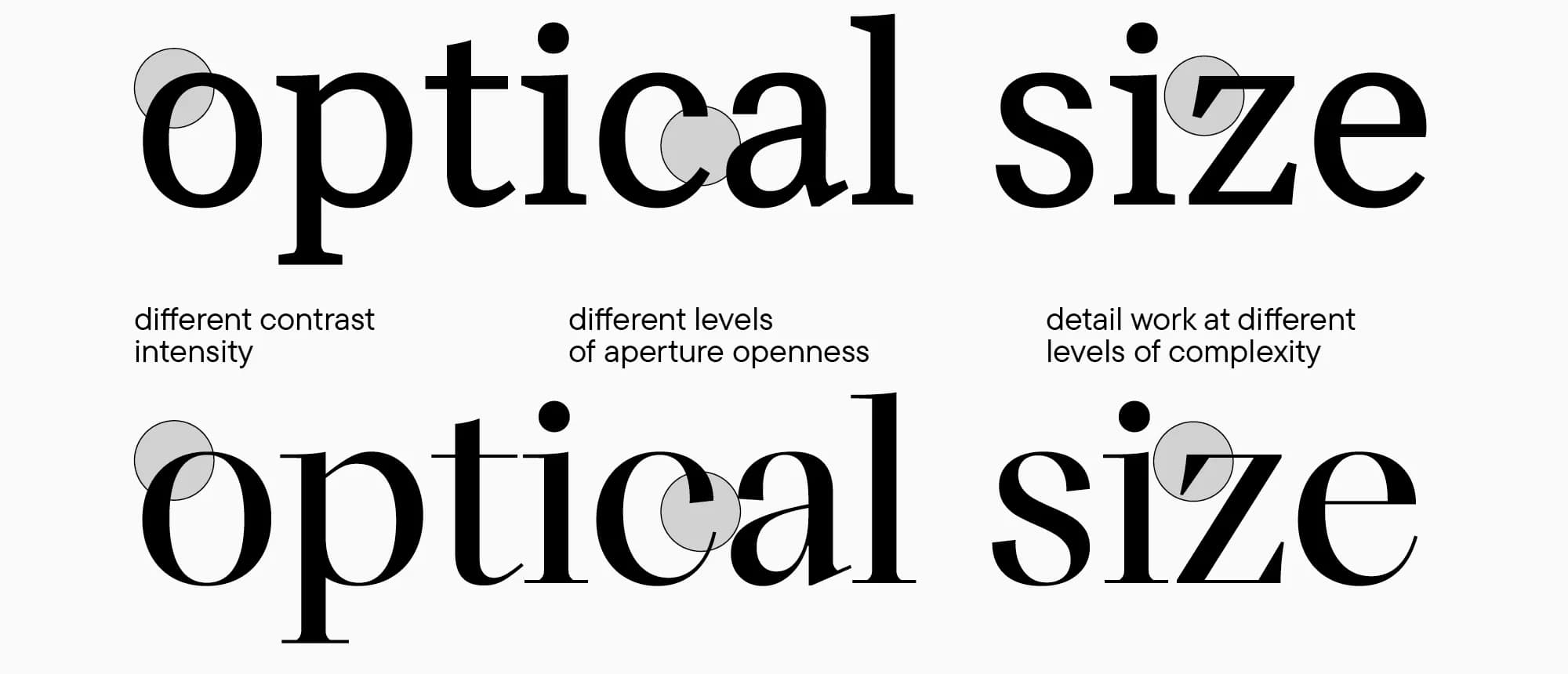
Optical sizes are versions of the same typeface with letterforms adjusted for different text sizes. Stroke thickness, letter proportions, fine details and spacing change, while the typeface retains a consistent overall appearance.
This approach is not new. When type was cast in metal, individual sizes were already adjusted to make them easy to read. Digital technology later made it possible to scale a single design up or down with ease. But that does not mean every shape works equally well at any size.
What small text needs
At small sizes, individual strokes and spaces need to remain clear. Details that look delicate and elegant in an enlarged preview can almost disappear in small text.
Designing versions for smaller sizes therefore often involves adjusting:
- Stroke thickness to keep strokes clearly visible.
- Spaces within letters to prevent them from appearing closed.
- Spacing between characters to keep the text from looking cramped.
Simply switching to bold does not replace these adjustments. It thickens the strokes but may not provide the changes to shapes and spacing that small text needs.
Headlines allow different details to stand out
Large text gives fine strokes and carefully shaped endings more room to stand out. A version designed for headlines may therefore have greater contrast between thick and thin strokes or tighter spacing.
Conversely, a design intended for small text can look unnecessarily coarse when enlarged significantly. This depends on the typeface. In some families, the differences between versions are obvious. In others, they only become noticeable in a direct comparison.
Optical adjustments apply to both serif and sans serif typefaces. They are not just about delicate serifs. Proportions and spacing can also be adapted in typefaces that have no serifs at all.
How to choose the right version
Assess the typeface at the size at which it will actually be used. An enlarged preview helps you examine the letterforms, but tells you little about how comfortably small text will read.
When choosing, it is worth:
- Checking with the type designer whether versions for different sizes are available.
- Testing complete words and paragraphs, including Czech diacritics.
- Comparing legibility on screen and in print.
- Checking spacing and line length too.
Some typefaces allow their letterforms to change smoothly according to text size. If the software also supports this feature, the adjustment can happen automatically. The result should still be checked in the finished design.
Typography guidelines should explain usage too
When working with a brand, it helps to specify which version of the typeface belongs to each kind of text. Alongside the family name and weight, it is therefore worth documenting the optical size variant, if the chosen typeface offers one.
In BrandCloud, these instructions can be accompanied by examples of correctly set text. People preparing new materials then have a clear reference and do not have to work out the right settings each time.
Optical sizes help maintain legibility and a consistent brand appearance. The differences in the letterforms may be subtle, but they make a difference when reading.