Just a few years ago, most technology companies could be recognized at first glance. Their visual identities were built around minimalist logos, simple shapes, and sans-serif fonts. The same approach was widely adopted across the artificial intelligence sector, where communication focused primarily on innovation, speed, and technological advancement.
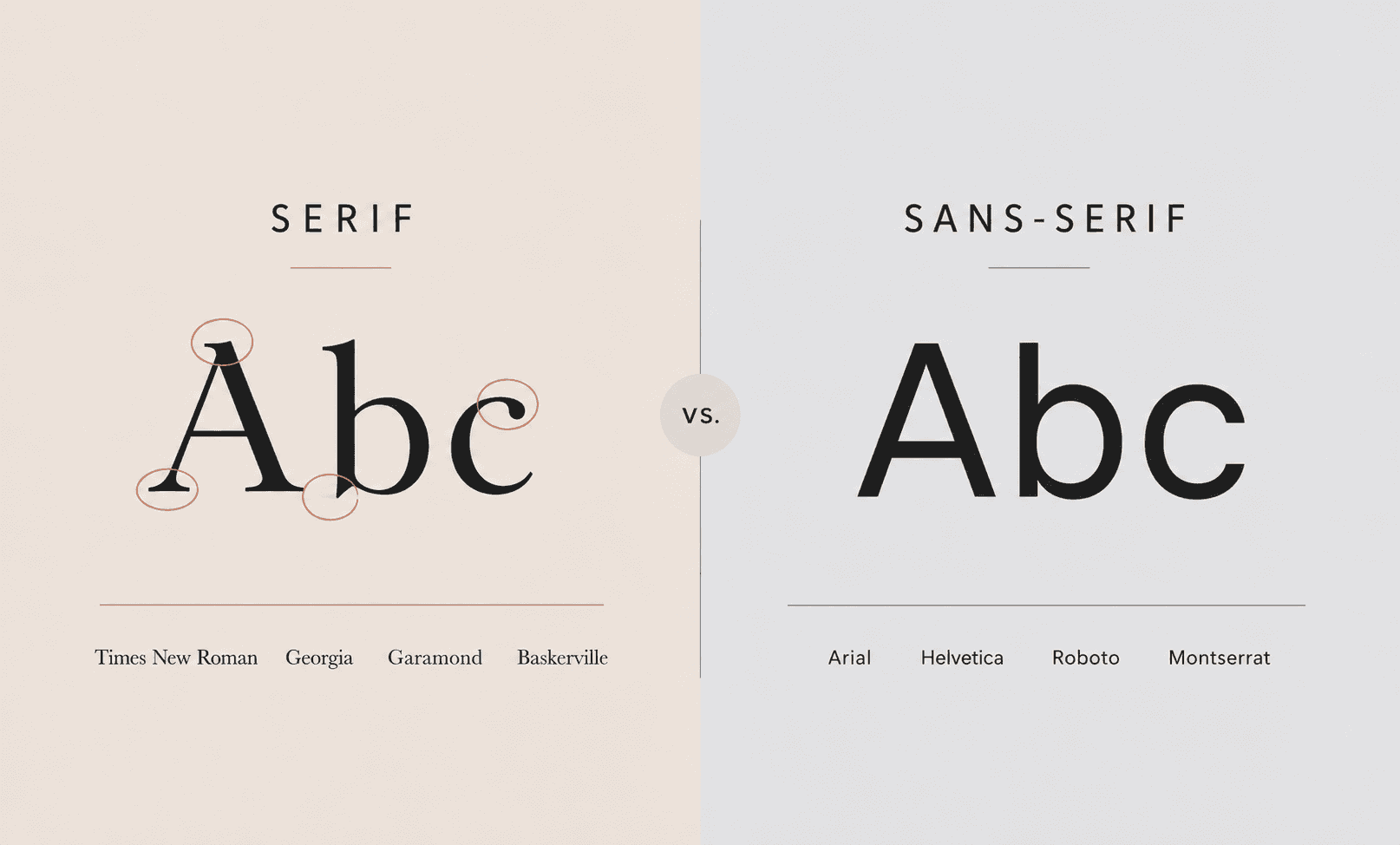
Today, however, a noticeable shift is taking place. More and more AI companies are embracing serif fonts—typefaces characterized by the small strokes or “feet” at the ends of letters. Typography that was once primarily associated with books, newspapers, and academia is now appearing in one of the most technologically advanced industries in the world.
At first glance, this may seem like a minor design detail. In reality, it reflects a much broader transformation in modern branding.
What Are Serif Fonts and Why Are They Making a Comeback?
Serif fonts are among the oldest typographic styles used in the Western world. Their history dates back to ancient inscriptions, and for centuries they were used in books, newspapers, academic publications, and official documents.
Because of this historical context, serif typefaces continue to be associated with trustworthiness, authority, and tradition. While sans-serif fonts are often perceived as modern, technical, and functional, serif typography tends to evoke a sense of stability and continuity.
The rise of digital technology changed this dynamic. Early computer screens favored simpler sans-serif fonts, and technology companies quickly adopted them as symbols of modernity. Over time, sans-serif typography became the standard of the technology industry, dominating digital products and brand identities for more than two decades.
Today, however, the trend is beginning to reverse.
Why AI Companies Are Moving Away from Traditional Tech Aesthetics
For decades, serif fonts were commonly used by brands seeking to communicate prestige, credibility, and expertise. Well-known examples include The New York Times, Tiffany & Co., and Vogue. In these cases, typography was far more than an aesthetic choice—it reinforced the way the brand was meant to be perceived.
Source: Wikipedia
The technology sector moved in the opposite direction. During the past two decades, many major companies transitioned to sans-serif fonts. One of the most notable examples was Google's 2015 rebrand, when its original logo was replaced with a simple sans-serif typeface. Similar decisions were subsequently made throughout the technology industry.
Source: Google
The rapid growth of artificial intelligence has created a new reality. While the primary objective in the past was to emphasize technological sophistication, attention is now increasingly focused on trust, transparency, and safety.
Users no longer need convincing that AI is an advanced technology. Instead, they want to understand who is behind it, how it works, and whether it can be trusted.
This is where serif fonts begin to make sense. They are associated with universities, research institutions, and established media organizations, helping brands appear more credible, stable, and trustworthy.
A clear example can be seen in Anthropic. From the beginning, the company's communication has been centered on AI safety and responsible development. Its typography supports this positioning and creates a distinctly different impression from the branding commonly associated with technology startups of the previous decade.
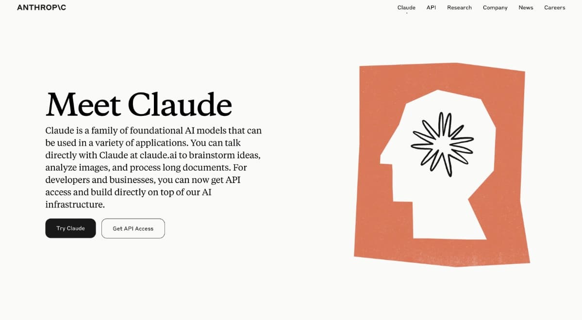
Source: Anthropic
At the same time, AI companies are changing how they want to be perceived by customers. Instead of emphasizing futuristic aesthetics, greater focus is being placed on accessibility, clarity, and human-centered communication. Typography has become one of the tools used to convey this shift.
When Every Technology Brand Looks the Same
The resurgence of serif fonts is not driven solely by trust.
Differentiation is another important factor.
Over the past decade, hundreds of technology companies adopted remarkably similar visual identities built around minimalist logos, geometric shapes, and sans-serif typography. The result was an environment in which brands became increasingly difficult to distinguish from one another.
Modernity became the standard.
And standards quickly become invisible.
As a result, many companies began searching for new ways to reintroduce character into their visual identities. Serif fonts offer a relatively simple way to create a more distinctive and memorable brand without completely redesigning an entire visual system.
Interestingly, this shift is not being led by traditional institutions. It is being driven by companies at the forefront of technological innovation. AI brands are demonstrating that modern branding does not have to rely exclusively on sans-serif typography.
What This Trend Means for Brands
The discussion around serif fonts is about far more than design. It raises broader questions about brand management and communication consistency.
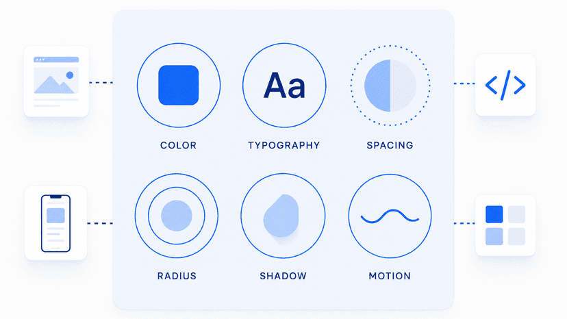
Fonts are often perceived as a minor detail. In reality, they are among the most visible elements of a brand's identity, appearing across websites, presentations, advertising campaigns, documents, and social media content.
When evaluating typography, brands should consider several key questions:
- Does our typography reflect how we want the brand to be perceived?
- Does it differentiate us from competitors?
- Is it used consistently across all channels?
- Does it support our brand personality and values?
- Are all teams working with the same approved assets?
This is where brand management tools become essential. If different teams use different versions of presentations, documents, or marketing materials, even the strongest typography strategy will struggle to deliver consistent results. BrandCloud enables organizations to manage fonts, templates, and other brand assets centrally, ensuring consistency across teams and channels.
Typography should therefore not be treated as an afterthought. Increasingly, it is becoming part of broader strategic decisions that influence how a brand is perceived.
The return of serif fonts among AI companies is not a nostalgic move back to the past. Rather, it suggests that technological sophistication alone is no longer enough. Brands are looking for ways to appear more trustworthy, authentic, and memorable.
It is striking that the companies building some of the world's most advanced technologies are increasingly turning to typography with centuries of history behind it. Some principles of communication do not become outdated. Technologies change. Products evolve. But the need for trust remains the same.