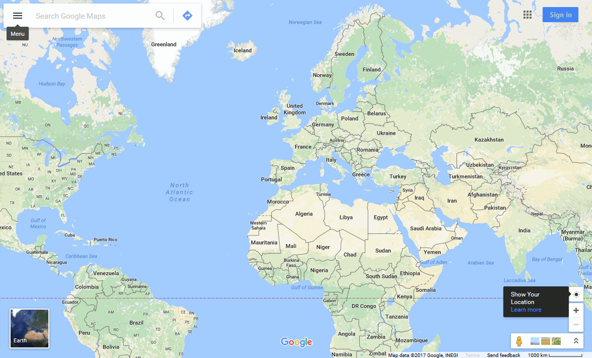
Google Maps is one of the most widely used digital mapping services in the world. The application helps users navigate spaces, plan routes, search for businesses, and monitor traffic conditions. In many cities it has become a normal part of everyday movement. People use it when traveling, looking for restaurants, navigating unfamiliar environments, or planning longer routes.
A service that is used this widely also needs a clearly recognizable visual identity. The logo must remain readable in a mobile application, on the web, and across different digital interfaces. The Google Maps brand has therefore undergone several visual updates over the years. Each change has reflected technological development as well as the way people use map applications.
What Google Maps is used for
Google Maps is a digital mapping service developed by Google that allows users to search for locations, plan routes, and navigate in real time. Users can view city maps, monitor traffic conditions, search for businesses, or obtain information about public transportation.
Today the application includes a large number of features. In addition to standard navigation, it offers traffic congestion insights, fuel-efficient route recommendations, and information about fuel prices. The maps also display important points of interest nearby, such as hospitals, schools, restaurants, or cultural institutions.
The application environment contains many graphical symbols. These help users quickly identify different types of places and orient themselves within the map. The use of symbols is also the reason why the iconic map pin became part of the visual identity of the service.
Source: Google Maps
What the new Google Maps logo looks like
In its latest update, Google introduced a modernized version of the Google Maps icon for both Android and iOS. At first glance, it still appears as the familiar map marker used to indicate a point on a map. A closer look, however, reveals several adjustments that change the visual character of the icon.
The basic shape remains the same. The marker still maintains its characteristic teardrop silhouette that users recognize from map applications. However, the proportions of individual elements have changed. The upper colored ring is now thinner than in the previous version, while the inner circle is noticeably larger. This makes the symbol appear more open and improves readability at smaller sizes.
Color usage has also undergone a visible transformation. The previous logo used clearly separated color blocks arranged diagonally. The new version uses a smooth gradient transition between the four colors associated with the Google brand. This gradient follows the current visual style that Google also applies to other products, including Search and Google Photos.
Overall, the icon appears more modern and better aligned with Google’s current visual identity. At the same time, it remains simple and recognizable even at small sizes, which is a crucial characteristic for mobile applications.
Source: Google Maps
What the Google Maps logo looked like in the past
The Google Maps logo has changed several times since 2005. Each version reflected both the evolution of the service itself and the changing visual identity of Google.
2005 – the first Google Maps logo
The first version of the logo appeared when the service launched in 2005. It consisted of a simple text-based design that followed the style of the Google logo used at the time. The word Maps was placed under the Google name together with a small Beta label. This version emphasized that the product was a new service within the broader Google ecosystem.
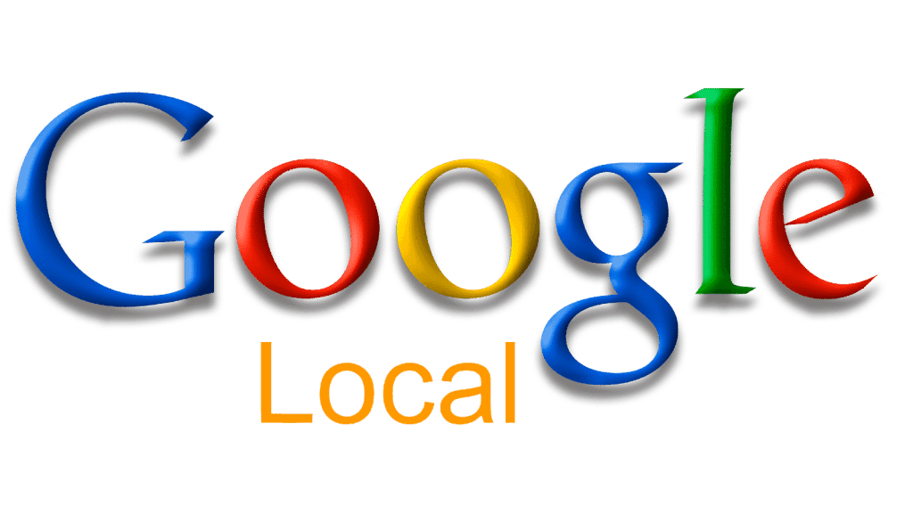
2005–2006 – transition to the Local label
During the first year of the application’s existence, the logo was modified. The Maps and Beta labels were removed and replaced with the word Local. Google used this change to highlight the service’s focus on searching for nearby places.
Source: Google Maps
2006–2009 – return to the Maps name
In the following version, the brand returned to the name Maps. The typography remained similar, but the wording in the logo changed. The goal was to clearly express the service’s focus on maps and navigation.
Source: Google Maps
2009–2010 – change in text layout
Another modification focused on the arrangement of the words. The word maps was moved to the right side of the Google logo and was written in lowercase letters in blue. This adjustment created a cleaner and more balanced composition.
2010–2015 – flatter and lighter design
In 2010 the logo underwent a more significant graphic simplification. Color gradients were removed from the lettering and the typography appeared flatter and more modern. This version remained in use for five years, which was the longest period without a redesign in the history of the brand.
Source: Google Maps
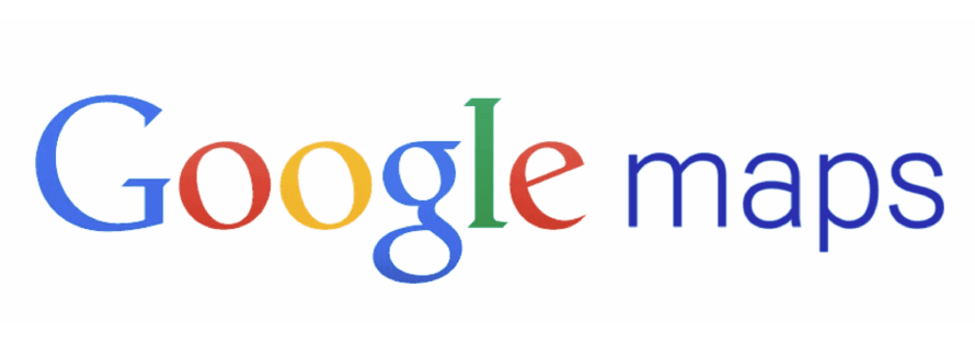
2015–2020 – new typography
A later redesign introduced a new typographic style that aligned with the broader Google brand identity. The word Maps was written in a modern sans-serif typeface and appeared more prominent than before.
2020 – 2026
During the fifteenth anniversary of the service, Google introduced a new version of the logo that for the first time combined the text name with a colorful map marker icon. The symbol clearly refers to the main function of the application – locating a position on the map.
Source: Google Maps
What the evolution of the Google Maps logo shows
The history of the Google Maps logo demonstrates how the visual identity of a digital service can gradually evolve. Over the years, the brand has undergone several adjustments while still maintaining a clear connection to Google’s visual style.
The changes have generally been relatively moderate. Designers gradually modified typography, colors, and symbolism without introducing a radical transformation of the service’s identity. As a result, the brand has remained easily recognizable to users.
The current logo emphasizes the map marker symbol together with Google’s color palette. This approach works well in mobile environments where simplicity and icon readability are essential.
At the same time, such changes also influence the way organizations manage their graphic materials. Once a logo redesign occurs, a large number of files must be updated—from presentations and marketing materials to digital products. In such situations, systematic digital asset management becomes useful. BrandCloud allows companies to store logos, graphic elements, and other visual materials in one place and ensures that teams always work with the most current versions.
The evolution of the Google Maps logo therefore illustrates how the visual identity of digital services continuously adapts to technological environments. It also highlights the importance of structured management of graphic assets in a time when brands are used across many digital channels.