When people think of branding, they usually picture a logo or a company's color palette. Yet one of the most distinctive elements of a visual identity is typography. The typeface a brand uses influences how it is perceived across every customer touchpoint—from websites and mobile apps to advertising campaigns. It is therefore no surprise that the renowned branding studio Koto has launched its own type foundry, CcType. Its debut reflects the direction in which brand typography is evolving today.
Koto expands its expertise with its own type foundry
London-based Koto is one of the most respected names in the branding industry. With studios in London, New York, Los Angeles, Berlin, and Sydney, it creates visual identities for international companies, including Amazon, Microsoft, Airbnb, and Stack Overflow. Typography has always been a core part of the studio's design process.
The launch of CcType is not a sudden change of direction but a natural extension of Koto's experience in creating brand identities. For years, the studio has designed custom typefaces for individual clients, and it has now decided to share its own perspective on contemporary typography with the wider design community.
According to the foundry's founders, modern typefaces must do far more than simply look good. They need to perform seamlessly across digital products, motion graphics, user interfaces, and traditional print materials, while maintaining a brand's distinctive character.
Source: Koto – CcType
CcType Mono combines technical precision with a distinctive personality
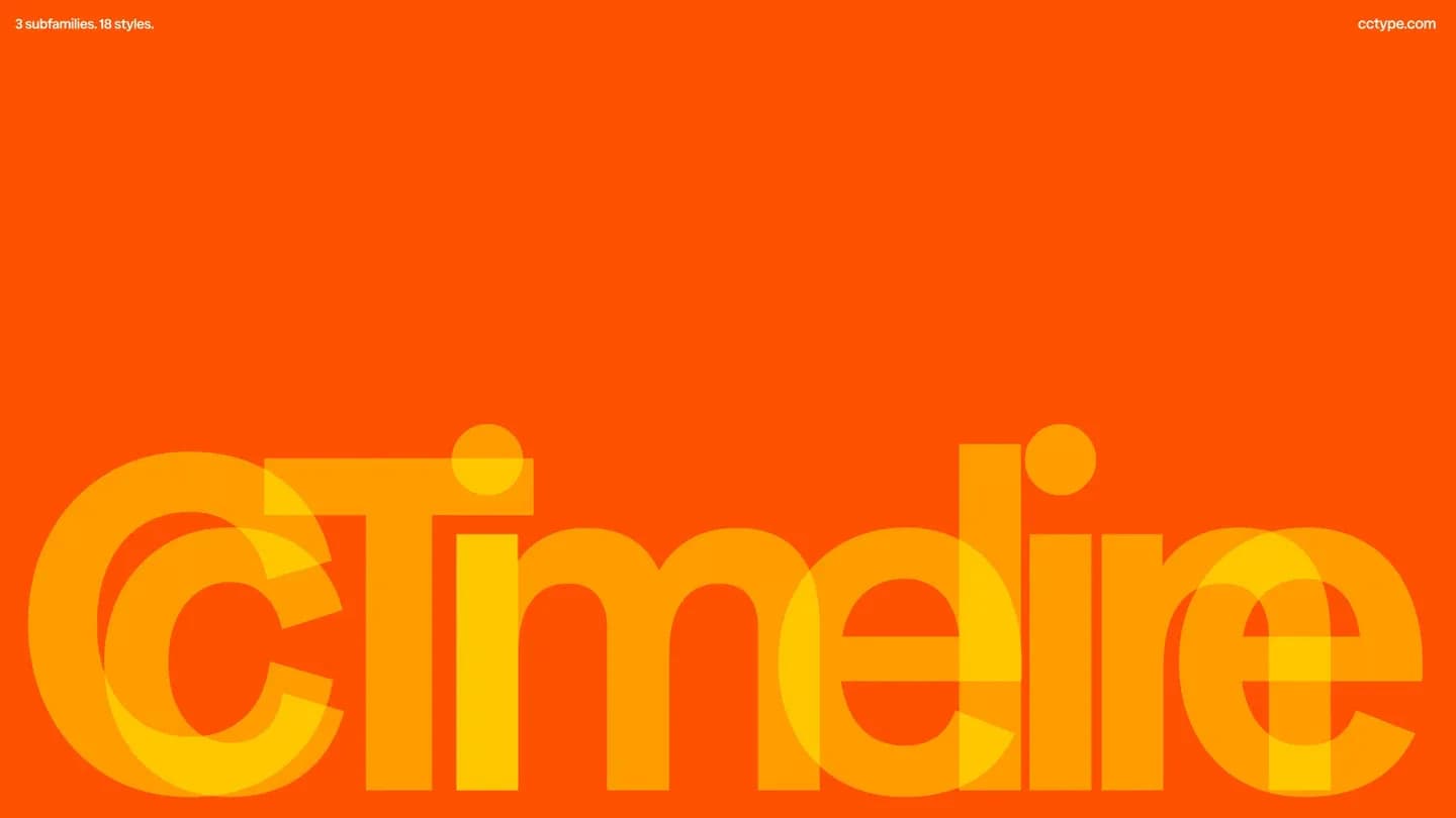
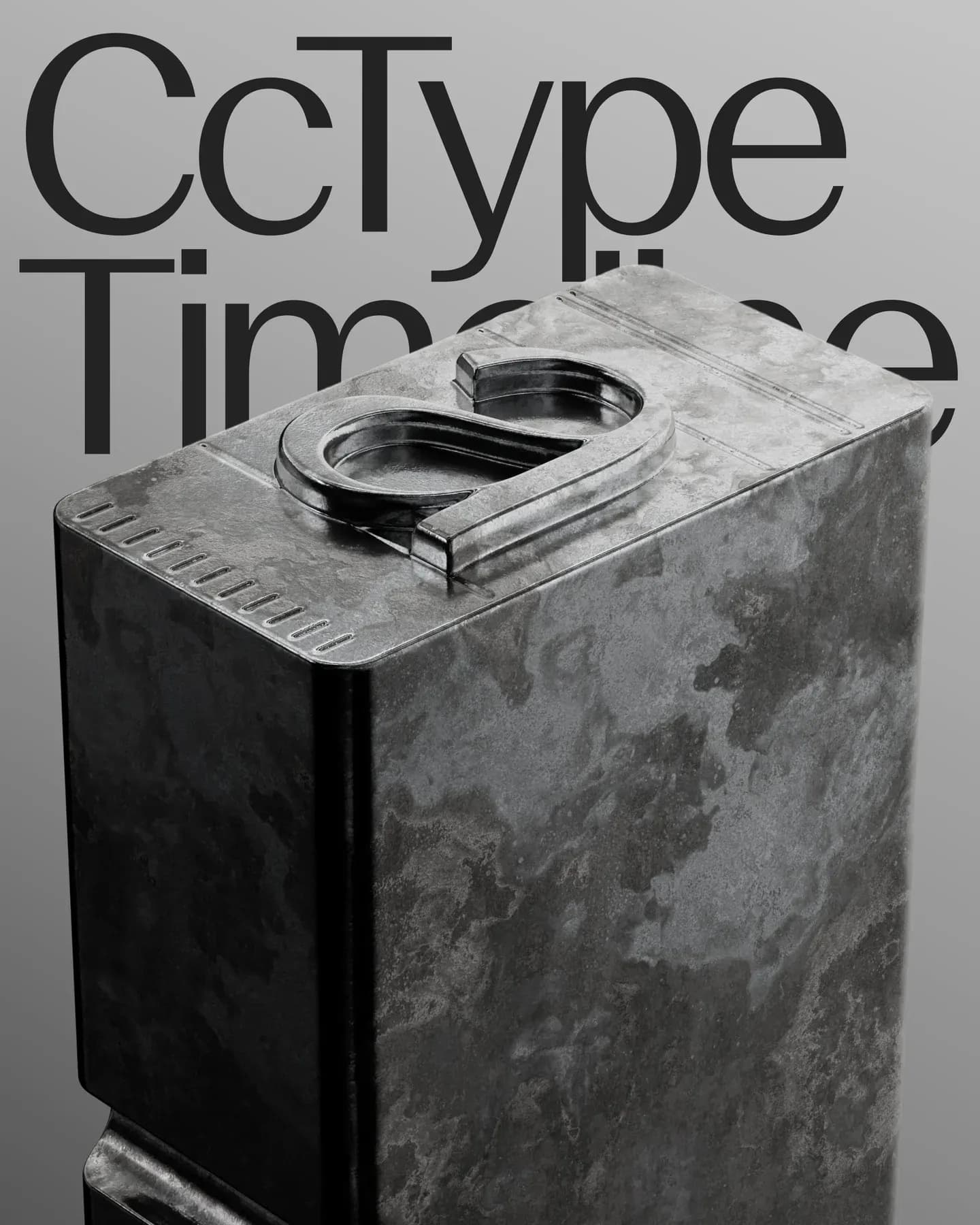
The first release from the new foundry is CcType Mono. Although it is based on the principles of monospaced typefaces, it avoids feeling cold or purely technical. Koto set out to create a font that delivers the precision required for digital environments while offering a strong visual identity of its own.
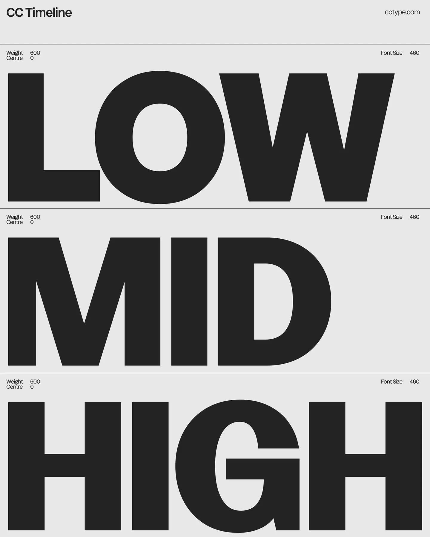
At first glance, CcType Mono stands out thanks to its wide letterforms, pronounced stroke contrast, and a number of unconventional details that give the typeface its unique character. As a result, it works equally well for short passages of text, bold headlines, and visually striking brand campaigns.
Motion was another major consideration during the design process. The team anticipated that today's brands increasingly communicate through animation, video, and interactive experiences. As a result, the typeface was developed with environments in mind where typography is no longer static but becomes an integral part of motion design.
In addition to its core styles, CcType Mono includes alternate glyphs and stylistic sets, allowing designers to tailor its appearance to the specific needs of each project. Rather than being a single-purpose font, it is designed as a flexible tool for building modern visual identities.
Source: Koto – CcType
Typography is taking on a new role in branding
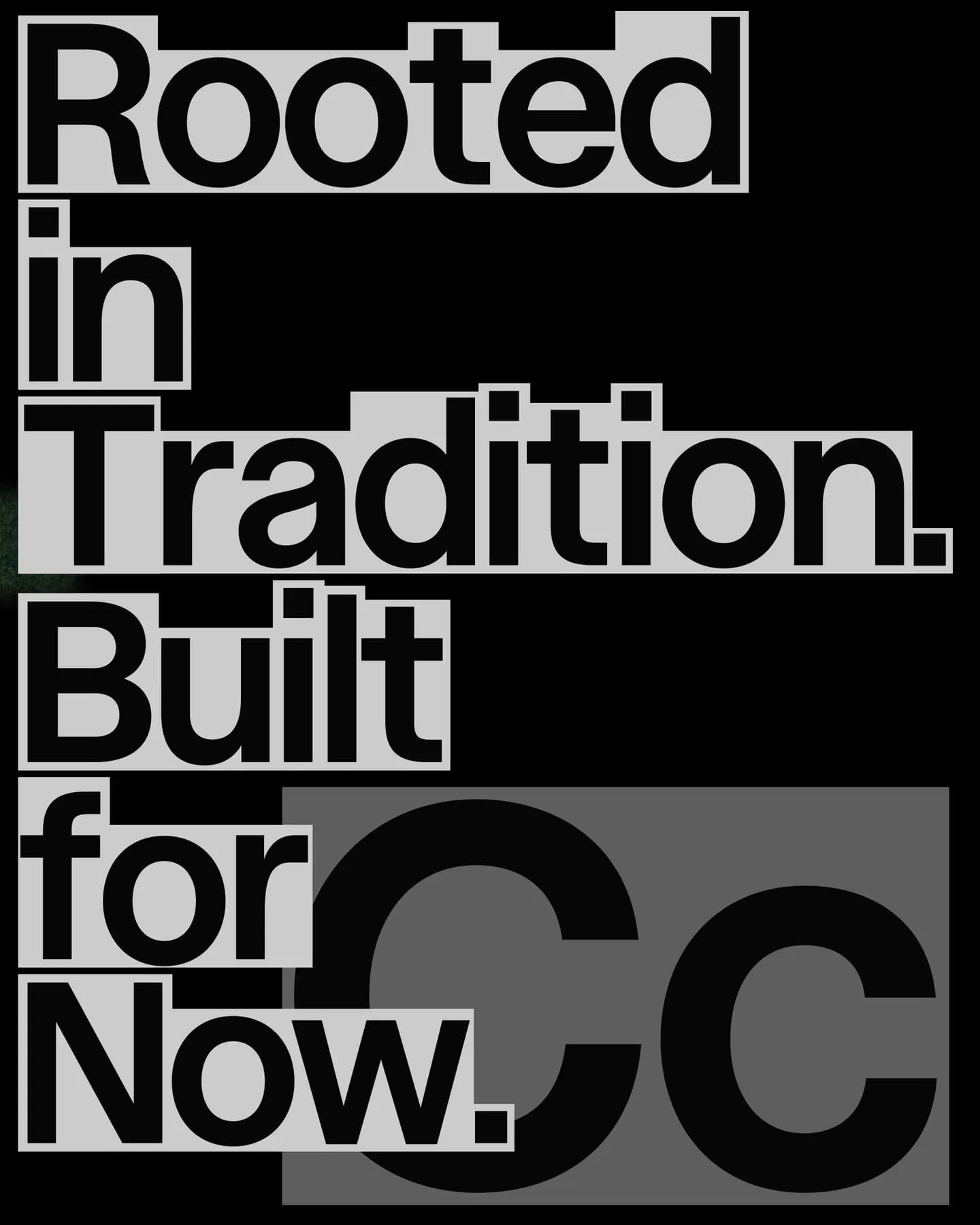
The launch of CcType reflects a broader shift in the way brands approach typography. While typefaces were once considered a complement to a logo or color palette, they have now become one of the most recognizable elements of a brand's identity.
This is why many global companies invest in proprietary typefaces. Netflix developed Netflix Sans, IBM created IBM Plex, Google continues to evolve Google Sans, and Airbnb introduced its own typeface, Cereal. The reason is straightforward: typography appears in almost every piece of brand communication, helping create a consistent visual language across every channel.
Koto is taking this trend a step further. Instead of designing one-off custom fonts for clients, it has established a dedicated foundry focused on meeting the evolving needs of both brands and designers.
Great typography also requires great management
Designing a high-quality typeface is only the first step. It is equally important to ensure that everyone works with the correct font versions and has access to up-to-date licenses. In larger organizations, different teams and external agencies often end up using different font files, leading to inconsistencies in brand communication.
That is why typefaces should be managed just like any other digital asset. BrandCloud enables organizations to store fonts alongside logos, brand guidelines, templates, and images in one centralized location. This ensures that marketing teams, designers, and external partners always work with the latest approved assets, helping brands maintain a consistent visual identity.
The launch of CcType serves as a reminder that typography is no longer just about aesthetics. It has become an essential part of a brand ecosystem that connects design, technology, and the day-to-day management of digital content.
Source: Koto – CcType