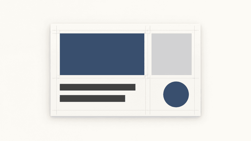
Two fonts can look good individually but feel mismatched when placed together. One has wide, rounded letters, while the other has narrow, sharp shapes. Alternatively, they may be so similar that switching between them looks like a mistake.
When pairing fonts, it is important to consider both their shapes and the jobs they need to perform in the design. A heading, a paragraph and a small caption place different demands on a typeface.
Headings and paragraphs have different needs
A heading typeface can be bold, condensed or decorative. Its personality can stand out in just a few words. In a long paragraph, comfortable reading matters more. An ornate typeface therefore usually needs a more restrained counterpart for body text.
It makes sense to start by choosing a font for the most demanding part of the content. For an article, this will be the longer text; for a poster, the main headline. The second typeface is then selected according to what it needs to complement. This approach helps avoid attractive pairings that only work in a three-word sample.
Serif and sans-serif fonts are not automatically a good match
Combining a serif and a sans-serif typeface creates a difference, but does not guarantee harmony. It helps to look for a shared feature, such as similar curves, proportions or stroke weight. Contrast can come from another characteristic — such as character width.
The height of lowercase letters, known as x-height, also matters. Two fonts set at the same size can appear different in size because their lowercase letters have different proportions. Font size should therefore be adjusted according to its actual appearance, rather than just the number shown in the editor.
Font weight needs similar consideration. Making a heading larger may not give it enough prominence. Stroke weight, typeface width and spacing also influence hierarchy.
Two specific pairings and what sets them apart
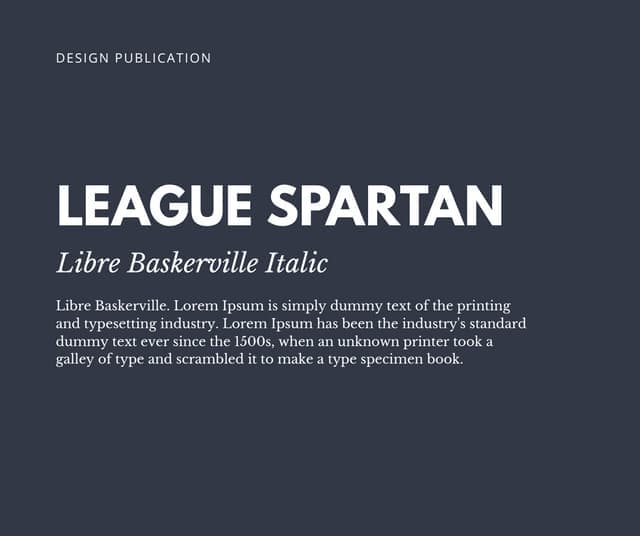
League Spartan and Libre Baskerville combine a geometric sans-serif typeface with a more traditional serif design. League Spartan can create a striking heading, while Libre Baskerville gives the body text a different character.
Bebas Neue and Montserrat rely primarily on contrasting proportions. The condensed shapes of Bebas Neue suit headlines, while Montserrat complements them with wider, more rounded characters. Contrast does not have to depend on the presence of serifs.
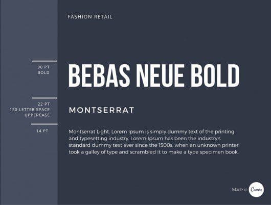
These pairings are starting points, not universal solutions. What matters is how they handle the actual heading length, amount of text and available space.
Starbucks pairs typefaces according to their purpose
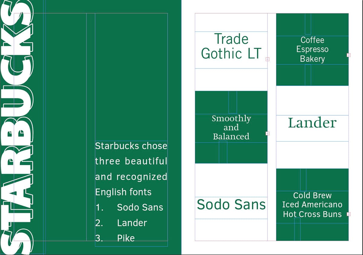
Starbucks brought together three typefaces with distinct roles in its typographic identity:
- SoDo Sans provides a versatile foundation and is often used for body text.
- Lander is a serif typeface that adds distinctive character to more expressive messages.
- Pike has condensed shapes and is used for functional headlines and wayfinding.
When considering a two-font pairing, the relationship between SoDo Sans and Lander is particularly useful. The first handles everyday communication, while the second adds an expressive accent. A distinctive typeface does not need to be used everywhere. Its character can stand out precisely because it is given a dedicated space.
Source: Behance
What to test before approving fonts
Rather than using an alphabet or a short English slogan, it is better to prepare an actual heading, a paragraph and the smallest caption size used in the design. The review should cover:
- Diacritics and the required styles. Test Czech characters in bold and italic as well.
- Character differentiation. Compare the numeral 1, uppercase I and lowercase l, particularly if the design includes codes.
- Legibility at the intended size. Assess a mobile page on a phone and printed material at its actual dimensions.
The test should also include a long heading. If it cannot fit without being made significantly smaller, the problem may lie in the choice of typeface rather than the wording itself.
Font choices must also work for the team
The result should be more than two font names. Guidelines should define how headings, paragraphs and captions are set, including the approved styles and weights. In BrandCloud, these instructions can be combined with examples and templates so that other creators do not have to reinterpret the pairing each time.
If the second typeface offers no clear benefit, a single family with multiple weights and styles may be more suitable. This can also distinguish different levels of text. A good font pairing works with real content — from the main headline to the smallest note.