Templates, preset fonts and ready-made graphic elements make it possible to create a design without deciding on every detail. Their use, however, raises the question of how much of the final appearance is shaped by the brand and how much by the tool used to create the material.
Default Design uses existing solutions as a starting point. For visual identity, it is useful when it simplifies recurring work and leaves room for the brand’s own character.
What is Default Design?
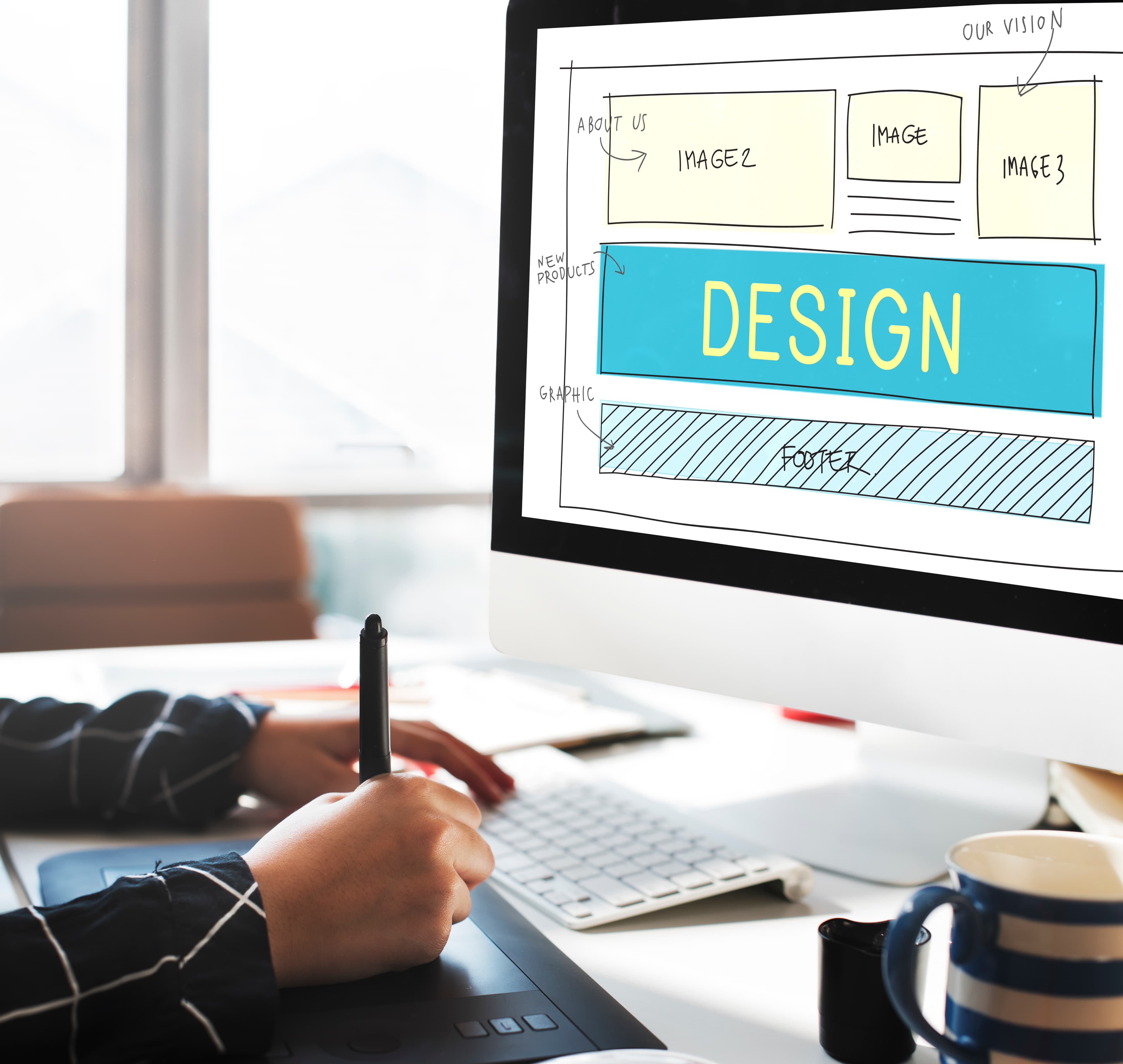
Default Design is an approach to design based on default settings, established patterns and ready-made elements. These might include a page layout, the appearance of a button or typography taken from a template.
It is not a clearly defined graphic style. The same principle can underpin a simple presentation or a more complex digital interface. What matters is which decisions the designer adopts and which they develop according to the needs of the specific project.
Reusing a common element does not necessarily indicate a lack of care. If a suitable solution already exists, using it allows more time to be spent on content, composition or how the brand presents itself.
From established patterns to design systems
Over time, digital design developed established patterns that appeared across applications. In early web applications, for example, it was common to move from a list of items to a separate detail page and make edits in another window. This structure was easy to adopt in new projects.
As interfaces evolved, more options became available for editing content in place or working with several pieces of information at once. The established pattern was no longer the only available approach. Design could respond more closely to the task a person actually needed to complete.
The next step is design systems — collections of reusable elements and rules. Here, default settings are developed within the company: an approved button, heading or information block becomes the foundation for subsequent designs.
A generic solution adopted from a tool can therefore become a custom standard that preserves the brand’s considered design decisions.
Simplicity is not the same as a default appearance
Minimalist design and Default Design can look similar, but they emerge in different ways. Minimalism deliberately limits the number of elements. A default appearance may remain simply because nobody has changed it.
The difference is visible in a product sheet, for example. One font and two colours may be enough if the design clearly separates the product name, specifications and additional information. If everything appears equally important, restrained graphics do not make the content easier to navigate.
Simplicity is valuable when it helps people understand the content. The number of colours or the absence of decoration alone does not determine the quality of a design.
What gives a simple visual identity its own character?
A brand does not need a large number of graphic elements to be recognisable. How it consistently uses a few selected elements can matter more.
Distinctive character can come from:
- Typography — typeface proportions, heading sizes and their relationship to body text.
- Photography — the choice of subjects, lighting, cropping and placement within the composition.
- Colour — defining which colour forms the foundation and which highlights important information.
- Layout — the recurring relationship between images, text and white space.
For example, two brands may use the same typeface. One relies on large, short headlines, while the other uses smaller typography and a denser arrangement of information. The resulting impression can therefore differ significantly.
Which decisions need a custom design?
In graphic design, every detail does not need the same amount of attention. It helps to distinguish between decisions according to their impact on the result.
A standard interface control can follow a proven pattern. By contrast, the structure of a product presentation or the approach to photography directly influences what the brand communicates and how it comes across.
Three questions help before approving a design:
- Does the chosen solution support the actual content?
- Does it fit the brand’s visual identity?
- Will it also work in the other required formats?
A preference for a particular tool or the team’s habits are practical considerations. However, a design’s suitability must be confirmed by using it in actual materials.
Visual identity and template management in BrandCloud
A considered visual identity needs rules that can also be applied in everyday creative work. Approved templates translate these rules into presentations, product sheets and other company materials.
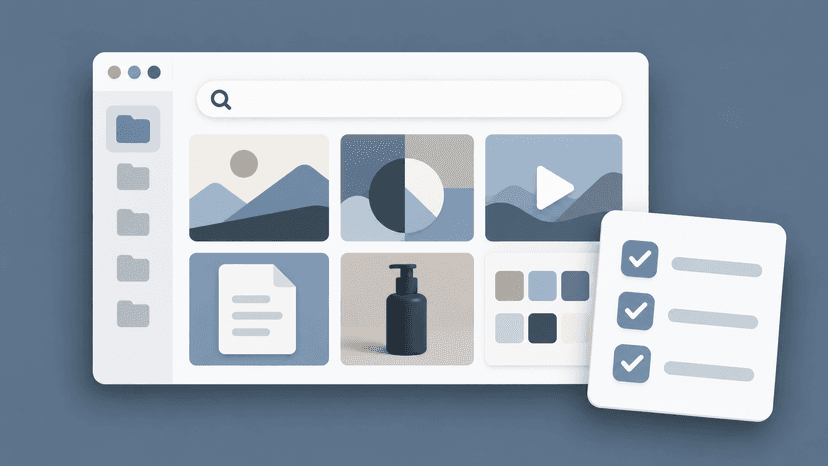
BrandCloud brings brand guidelines, approved templates and brand assets together in one place. Examples using real content help explain how to apply typography, photography and page layouts.
Default Design then takes a useful form: the team starts with a foundation that fits the brand. Simple graphic design is built on specific decisions that can be repeated, developed and clearly communicated to other creators.