
When a new visual identity for a major sporting event is unveiled, most of the attention usually goes to the logo or mascot. For the 2026 FIFA World Cup, however, the conversation quickly shifted to another design element—the tournament's custom typeface. FIFA introduced the FWC26 font as part of the event's new visual identity, and it immediately sparked discussion among designers. Some praised its distinctive personality, while others questioned its legibility at smaller sizes. The debate highlights an important point: typography is much more than a visual detail. It shapes how we perceive a brand and influences how effectively it communicates across everyday touchpoints.
Why Brands Are Creating Custom Fonts
A few years ago, custom typefaces were primarily associated with major technology companies. Today, they have become a standard component of the visual identities of many global brands. Netflix has Netflix Sans, IBM developed IBM Plex, Google uses Google Sans, and Airbnb introduced Cereal. The reason is simple: a custom typeface helps create a consistent visual language across every communication channel.
A brand's typography appears almost everywhere—on websites, mobile apps, presentations, advertising campaigns, and social media. When designed specifically for a brand, it strengthens recognition and helps ensure a cohesive look and feel regardless of the platform or format.
FIFA followed the same approach while developing the identity for the 2026 FIFA World Cup.
Why the FWC26 Font Was Created
The 2026 FIFA World Cup will be the largest tournament in the competition's history and the first to be hosted jointly by the United States, Canada, and Mexico. Its visual identity therefore needed to work seamlessly across three countries, dozens of stadiums, and thousands of digital and printed applications.
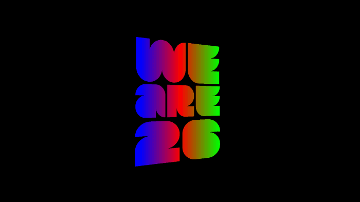
The custom FWC26 typeface became a central part of that system. Its narrow geometric letterforms create a modern, dynamic appearance while allowing designers to work with bold typography even in limited spaces. Rather than serving as just another font, it was designed as a recognizable signature element that connects every piece of the tournament's visual communication.
Unlike conventional commercial typefaces, FWC26 was never intended to be a universal font for everyday body text. Its primary purpose is to reinforce the World Cup 2026 brand and give the tournament a distinctive visual identity.
When Design Meets Usability
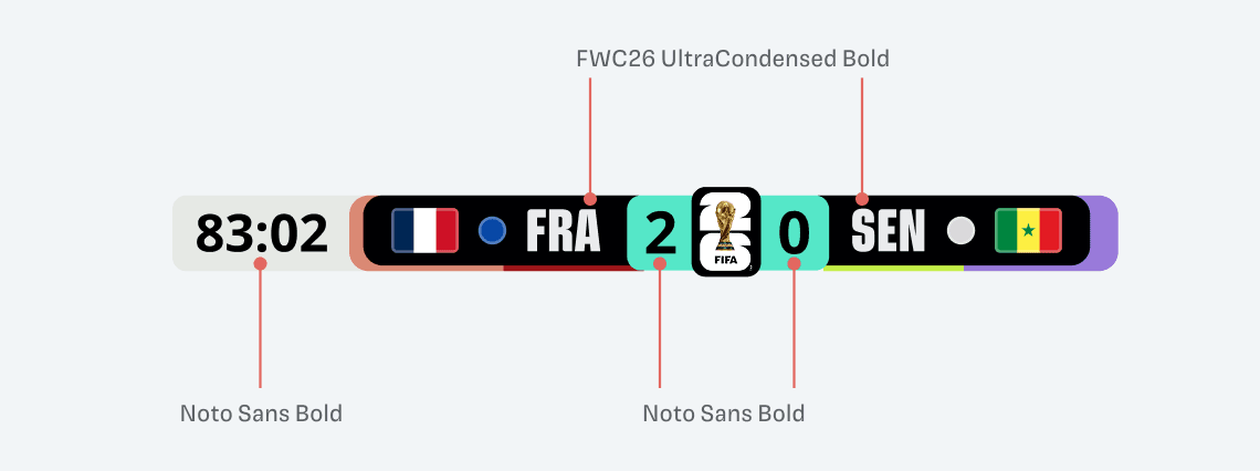
Although the new typeface attracted attention for its distinctive style, it also received criticism. Some members of the design community pointed out that its highly condensed letterforms can become difficult to read at smaller sizes. Television graphics and three-letter team abbreviations are often cited as examples, where information must be understood almost instantly.
This challenge is not unique to FIFA. Many brands face a similar balancing act. A typeface may look striking on a poster or homepage while proving less effective for small text, tables, or user interfaces.
That is why most large organizations rely on multiple typographic styles. One typeface is optimized for bold headlines and campaign materials, while another is intended for longer reading or functional information. The objective is not to create the most eye-catching font possible, but one that performs well in every context.
Typography Is Part of the User Experience
When building a visual identity, companies often focus on colors, imagery, and logos. Typography deserves just as much attention because it directly affects the everyday experience of users. If text is difficult to read or visually confusing, it makes consuming information less comfortable regardless of the platform.
The same principle applies to sports broadcasts, corporate websites, mobile applications, and internal documentation. A successful typeface is more than a design element—it should guide users, improve readability, and perform consistently across different screen sizes and devices.
This is where the difference between an attractive graphic concept and a well-designed visual identity becomes clear. Strong brands aim to balance originality with functionality.
What Other Brands Can Learn
Very few companies will invest in developing a custom typeface, but the 2026 World Cup still offers valuable lessons. It demonstrates the importance of treating visual identity as a connected system rather than a collection of individual assets. Typography, logos, colors, photography, and templates should work together consistently across every touchpoint, from billboards and social media to mobile applications. That is why leading brands test more than appearance—they also evaluate readability, usability, and real-world performance. Managing these assets is equally important. When employees or external partners use different versions of logos, fonts, or templates, brand consistency quickly begins to break down. BrandCloud helps centralize digital asset management, ensuring that every team member has access to approved materials and that the brand remains consistent across all communication channels.
A Great Font Is Only the Beginning
The discussion surrounding FWC26 is about more than a single typeface. It serves as a reminder that successful visual identities are built on much broader foundations. Distinctive typography can help a brand stand out, but it is only one part of the equation. Real value comes when every element—from the logo and typeface to digital assets—works together as a unified system and is used consistently.
That is why more organizations are investing as much effort in managing their visual identity as they do in designing it. After all, a brand is not created inside a design application—it comes to life everywhere people interact with it.