
Digital products are competing for users’ attention more than ever before. Content is consumed quickly, often within just a few seconds. Decisions are made intuitively, and users usually do not pay attention to every interface element. This is precisely why visual hierarchy has become one of the most important principles of modern UX design.
Many digital products today fail not because they lack features, but because of unclear communication. Interfaces are often overcrowded, individual elements compete for attention, and users frequently cannot immediately recognize what is important. The result is uncertainty, slower orientation, and a higher probability of leaving the page.
A well-designed visual hierarchy is created through deliberate work with element size, contrast, color, typography, and spacing. As a result, information is perceived in a clear order and users are guided through the interface naturally.
What Is Visual Hierarchy
Visual hierarchy represents the way interface elements are arranged according to their importance. Its goal is to ensure that users can immediately recognize which information or actions have the highest priority.
This principle is based on working with the visual properties of individual elements. Most commonly, size, contrast, color, page placement, typography, or the amount of white space around content are used. More prominent elements naturally attract greater attention, while less important information recedes into the background.
In digital products, visual hierarchy is present almost everywhere. Users may first notice the main headline, then a prominent button, and only afterward supporting text or secondary navigation. If the hierarchy is set correctly, orientation becomes intuitive and effortless.
Poorly designed hierarchy, on the other hand, leads to chaos. Users do not know where to look first, which information matters most, or what action should be taken. In these situations, user experience often deteriorates, along with the overall effectiveness of the digital product.

Why Visual Hierarchy Determines UX Quality
Visual hierarchy determines the order in which interface elements are perceived. Through design, it influences where users look first, what they ignore, and how quickly page content is understood.
In many cases, the same information can perform completely differently depending on how it is presented. If content is not properly prioritized, users become overwhelmed and orientation worsens.
A frequently mentioned example of effective visual hierarchy is Airbnb. The homepage is dominated by a strong headline and a search bar that immediately directs users toward the primary action — finding accommodation. Large destination images are also used to create emotion and attract attention. Important buttons, such as Search, are highly contrasting and clearly separated from surrounding content.
As a result, the interface feels natural and easy to understand. Users do not need to overthink where to begin or how to continue. Attention is guided intuitively.
And that is what defines high-quality UX. It does not overwhelm. It navigates.

Source: Medium
When Everything Is Important, Nothing Works
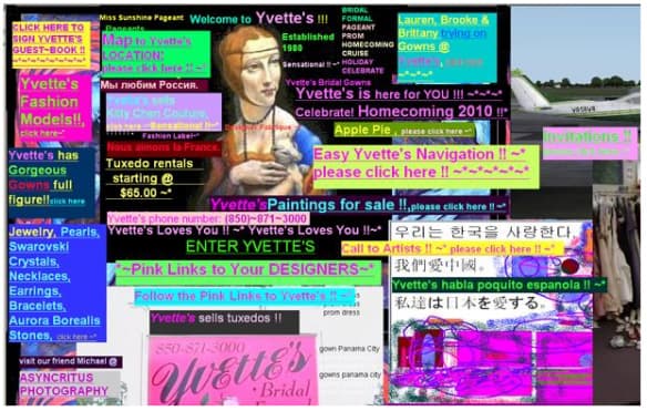
One of the most common mistakes in digital products is attempting to emphasize too many elements at once.
Large headlines. Prominent banners. Animations. Bright buttons. Pop-up windows. Multiple promotional messages displayed simultaneously. The result is often an environment that feels aggressive and cluttered.
If everything appears equally important, users lose the ability to orient themselves quickly. Attention becomes fragmented between competing elements, slowing down decision-making. The more visual stimuli are used, the harder it becomes to understand the primary message.
This is why modern UX increasingly emphasizes simplicity and clear content prioritization. The goal is not minimalism for appearance alone. The purpose is to create an interface that guides users naturally and without unnecessary uncertainty.
A well-designed visual hierarchy can significantly reduce the time required for orientation. Users immediately understand where to look, what to do, and which information matters most.
Source: garborkvax
Visual Hierarchy Influences Trust in a Digital Product
Visual hierarchy is not connected only to aesthetics or usability. It also affects overall brand perception and the credibility of digital environments.
Chaotic interfaces often feel untrustworthy, even when the actual service functions well. Users form first impressions very quickly, and content structure is one of the strongest factors shaping that impression.
If navigation is confusing, important information is difficult to find, or interface elements feel inconsistent, user experience deteriorates. In many situations, the problem is interpreted as a product issue, even though it is actually a problem of communication and orientation.
For this reason, increasing attention is being placed on consistency across digital systems and content management. BrandCloud enables the organization of assets, brand manuals, and additional materials in a way that supports clarity and faster orientation across teams. Consistent content management helps create environments that feel professional and understandable.
How to Work With Visual Hierarchy
A strong visual hierarchy does not happen by accident. Every interface element must have a clearly defined priority and place within the overall structure of the page. If users cannot immediately recognize what matters most, orientation and decision-making become slower.
The greatest attention should always be focused on one primary action or message. Once multiple elements compete for the same level of attention, the interface begins to feel cluttered and chaotic. A common problem is the excessive use of bold colors, large headlines, or multiple CTA elements on a single screen.
An important part of visual hierarchy is also the use of space. White space between sections helps separate information and improves readability. Contrast, element size, and properly structured typography are equally important. These principles help users intuitively understand which parts of the interface are primary and which serve a supporting role.
Several principles have consistently proven effective in digital product design:
- define one dominant element on every screen
- use contrast consistently
- limit the number of heading styles and sizes
- leave enough space around content
- remove distracting elements
- test where users look first
Consistency across the entire digital environment is equally important. If individual pages use different structures or conflicting content priorities, user experience worsens and orientation becomes more difficult.
