
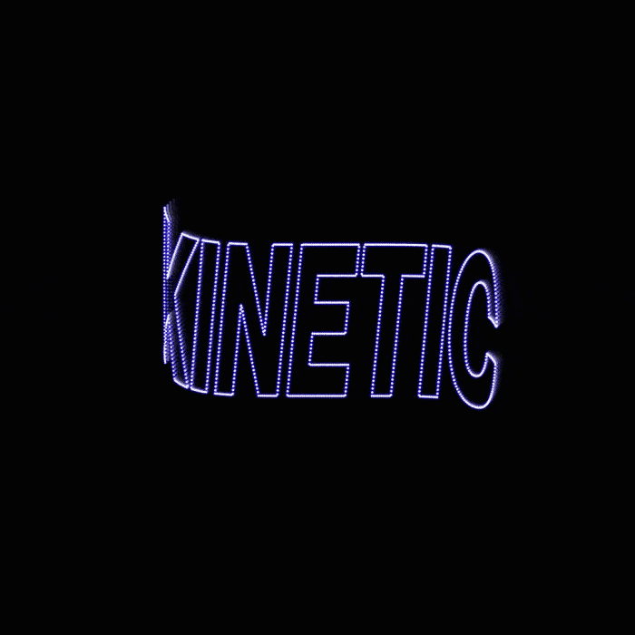
Kinetic typography refers to working with text in motion. Instead of being presented as a static element, text becomes a dynamic part of visual communication. Individual words, letters, or entire sentences appear, disappear, change size, or shift in rhythm. The result is a message that captures attention more effectively while naturally guiding the viewer toward understanding the content.
With the development of digital media, this approach is becoming increasingly prominent. Brands now communicate through video, animation, and interactive formats, where static typography is often not sufficient. Motion allows text to function as an active carrier of meaning, capable of working with timing, emotion, and context.
What is kinetic typography and how does it work
Kinetic typography is based on the principle of text animation. The type changes over time and responds to the content of the message. It may gradually reveal itself, move dynamically across the screen, or transform its shape.
This approach is built on several principles that together influence how text is perceived. Timing determines when and in what order information appears. Rhythm shapes the pace of reading and can emphasize the importance of specific parts of the message. Visual emphasis then allows certain words or elements to stand out so they are immediately noticed.
Unlike traditional typography, which is designed for static environments, kinetic typography assumes that text is part of a moving image. The viewer does not only read the text but also watches it as a visual element.
Why kinetic typography is gaining importance in branding
The digital environment has significantly changed how people consume content. Short-form videos, social media, and advertising formats place strong emphasis on fast and clear communication. In this context, kinetic typography offers an effective way to capture attention within seconds.
Motion helps increase audience engagement, improves message recall, and makes it easier to structure information. Text is no longer perceived as a continuous block but as a sequence of visually guided messages that unfold over time.
In addition, brands can use animated typography to build a more distinctive visual identity. The style of animation, pacing, and the way text is handled can become recognizable elements, similar to colors or graphic motifs.
Where kinetic typography is used in practice
Kinetic typography is now used across a wide range of formats. It is most commonly seen in videos, advertisements, and social media content, where communicating a message quickly is essential.
Typical use cases include:
- video intros and presentation openings
- advertising spots
- social media content
- educational videos and explainer animations
Thanks to the availability of tools and templates, particularly in motion design environments, this approach is becoming more accessible to smaller teams. Pre-designed animations make it possible to create professional-looking outputs without extensive technical expertise.
How kinetic typography influences brand perception
Motion in typography makes it possible to work with emotion and tone in communication. Fast, dynamic animations can feel energetic and contemporary, while slower, smoother transitions can convey elegance and stability.
Through typography, brands can strengthen their identity, unify their visual style across channels, and adapt communication to different contexts. At the same time, it is important that motion is not used without purpose. If animation does not support the message, it can reduce clarity instead.
How kinetic typography fits into digital brand management
As the volume of digital content grows, so do the demands for organization and consistency of visual materials. Animated outputs, video variations, and different language versions need to be managed just as systematically as static assets.
In this context, digital asset management tools become essential. BrandCloud allows teams to store, share, and organize not only static files but also video content and animations. This ensures access to up-to-date materials and helps maintain consistency in how kinetic typography is used across the brand.
A centralized environment makes it easier to control how assets are used and to keep communication consistent across campaigns and channels.
Where typography in branding is heading
Kinetic typography illustrates how visual communication is evolving. Text is no longer just a supporting element of design, but a fully developed tool capable of carrying both meaning and emotion.
For brands, this means thinking about typography in a broader context. It is no longer enough to design type for static use. It is necessary to consider how it behaves in motion, how it performs in video, and how it adapts to different digital formats.
This approach opens up space for more creative ways of delivering messages, while also placing emphasis on structure and consistency. The combination of these two aspects ultimately determines whether brand communication feels coherent and understandable in an environment that is constantly evolving.
