
When Monotype introduced Gotham Variable this year, it was not presented as just another extension of a well-known font. Instead, it marked the transformation of one of the most iconic typefaces of the past two decades into a system designed for today’s digital environment.
Gotham has become far more than a standard corporate font. Over the years, it has evolved into a symbol of modern communication, digital branding, and the minimalist aesthetic associated with major global brands. That is precisely why this year’s redesign attracted so much attention.
At the same time, this is not a radical redesign. Quite the opposite. Gotham Variable clearly demonstrates how brands are now approaching the evolution of visual identity. Rather than dramatic visual changes, the underlying infrastructure of design is increasingly being refined and optimized.
One of the world’s leading typography companies stands behind Gotham
Monotype is considered one of the most influential companies in typography and digital branding. The company combines type design, technology solutions, and font management for global brands, while its Monotype Fonts platform provides access to a library of more than 250,000 fonts from both established and contemporary type foundries.
Typography is no longer perceived solely as an aesthetic addition to visual identity. Fonts are increasingly functioning as part of a brand’s technological infrastructure. Flexibility, performance, responsiveness, and consistency across dozens of digital environments are now expected.
That is why Gotham Variable does not feel like a standard font family update. The project is positioned more as a modern design system adapted to the workflows of contemporary designers, developers, and global brand teams.
Gotham became a symbol of modern communication
Few typefaces are as strongly connected to a specific cultural moment as Gotham. The wider public most commonly associates it with Barack Obama’s 2008 presidential campaign, where Gotham Bold became the primary typeface of the Obama for America campaign.
Source: Monotype
At that moment, Gotham came to represent modern political communication. The typography appeared confident, open, and human at the same time. It did not feel overly corporate or rigid, which significantly contributed to creating an identity that became instantly recognizable.
Gotham quickly expanded beyond political branding. It was gradually adopted by brands such as Netflix, Coca-Cola, and Saturday Night Live. It also appeared in the communication of the United States Postal Service. Over time, it became a universal visual language of modern communication.
And that is what makes this year’s transformation particularly interesting. Gotham did not need to be completely reinvented. It needed to be adapted to today’s digital environment.
Gotham Variable was created to celebrate the typeface’s 25th anniversary
Monotype introduced Gotham Variable to mark 25 years since Gotham first appeared publicly on the January 2001 cover of GQ magazine. The original typeface was designed by Jonathan Hoefler and Tobias Frere-Jones, and over the following years it became one of the most widely used fonts of the modern era.
The new variable version, however, introduces far more than cosmetic changes.
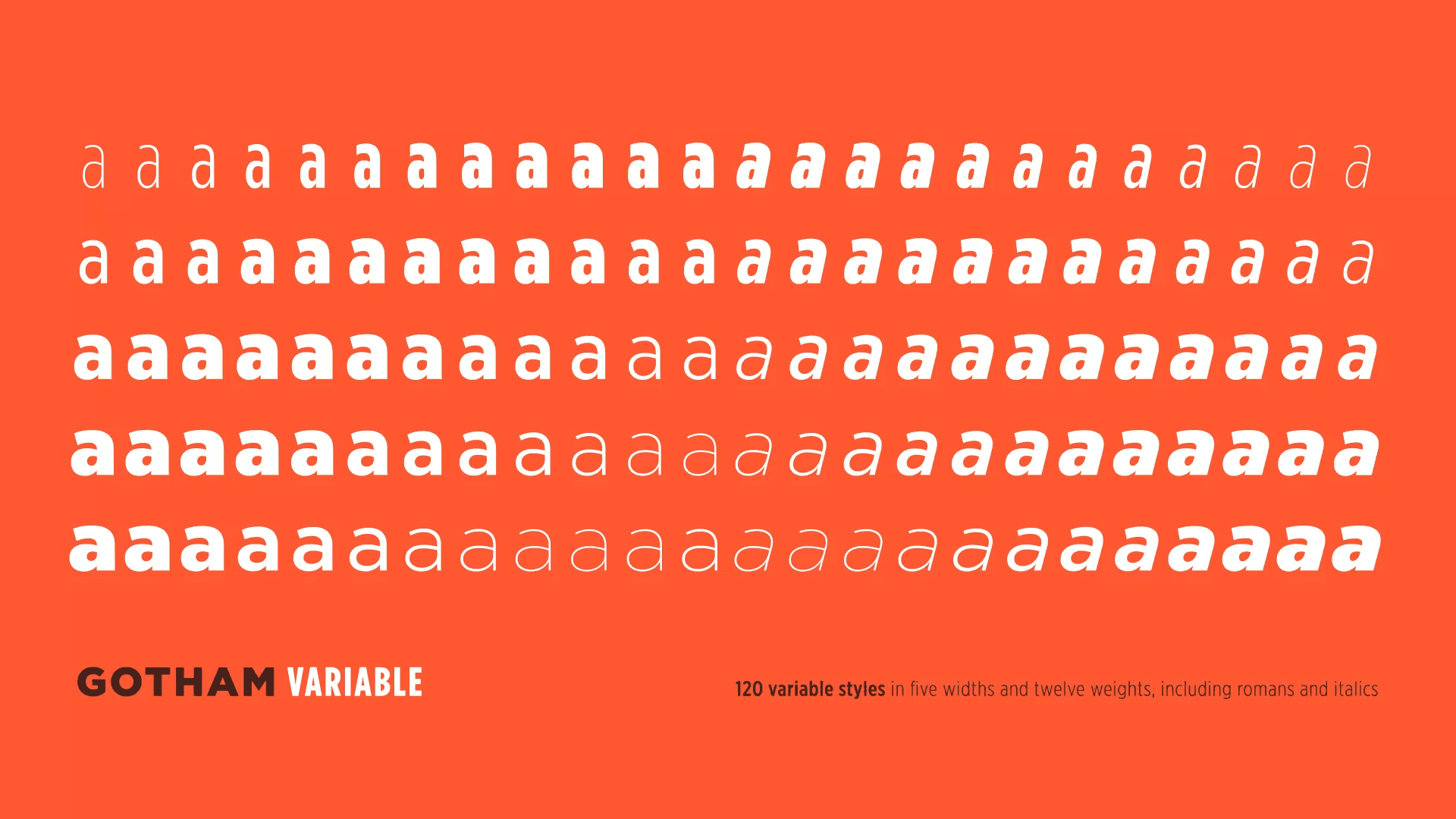
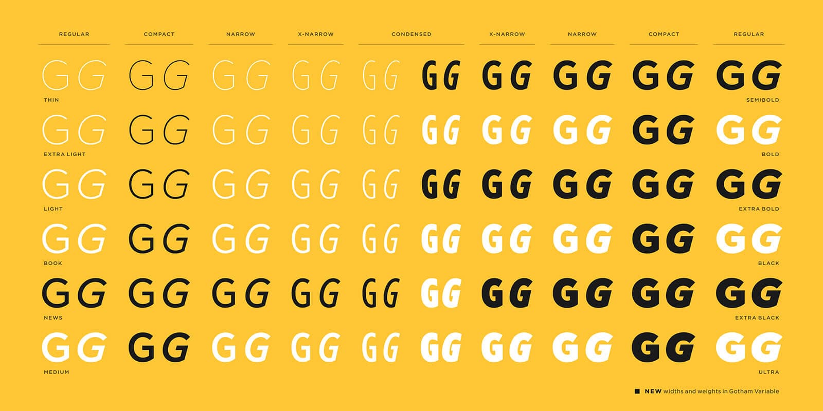
Gotham Variable enables continuous adjustment of both weight and width within a single font file. Designers are therefore able to fine-tune the character of the typography without switching between separate font styles. Performance, loading speed, and implementation across digital platforms were also optimized.
Source: Monotype
Monotype also expanded language support, including Vietnamese, while improving Cyrillic and Bulgarian support so Gotham could function within a significantly broader global environment. The update additionally introduced 54 new intermediate styles that had never previously existed within the Gotham family.
Among the main improvements introduced with Gotham Variable are:
- continuous control over font weight and width
- significantly simplified implementation across digital platforms
- optimized performance and faster loading speeds
- expanded language support
- new intermediate styles previously unavailable in the Gotham family
The entire project therefore feels much more like the evolution of a system than a traditional redesign of a famous typeface.
Source: Monotype
Brands are no longer redesigning only logos, but entire systems
For many years, branding was associated primarily with logos and visual identity. In digital environments, however, it is becoming increasingly apparent that a logo alone is no longer enough.
Modern brands now operate simultaneously across dozens of different environments. Websites, applications, internal systems, social media, dashboards, and digital kiosks all place different demands on readability, performance, and communication consistency.
That is precisely why design systems are becoming increasingly important. The focus is no longer placed solely on how a brand looks, but also on how it functions across multiple platforms.
A similar approach can be seen in companies such as Stripe or Figma. Typography is not used there merely as a visual element. It is used to structure orientation, hierarchy, and the overall perception of the product.
We previously discussed the broader rise of variable fonts in the article Why Variable Fonts Are Becoming More Popular. Gotham Variable, however, demonstrates a much larger shift. The discussion is no longer only about technology, but about the changing way brands approach typography as part of a design system.
This also relates to the management of brand assets themselves. When working with large digital identities, the centralization of approved fonts, design systems, and visual materials is becoming increasingly important. BrandCloud makes it possible to organize typography and other brand assets from a single location, helping maintain consistent communication across teams and external partners.
Gotham shows where branding is heading
Gotham Variable clearly illustrates one important shift in contemporary branding. The most significant changes today often happen beneath the surface.
Instead of dramatic redesigns, the structure of the design system itself is being refined. Typography, responsiveness, performance, and cross-platform functionality are being optimized.
That is precisely why Gotham still works after twenty-five years.
Not because it tries to be extravagant. Not because it attempts to shock audiences at any cost. But because it is capable of adapting to new digital environments without losing its identity.
And that is becoming increasingly important for modern brands today.

