Digital interfaces today are undergoing a significant transformation. What until recently was built on simplicity and flat design is gradually returning to working with depth, light, and a sense of materiality. Design is once again trying to get closer to the physical world. The question, however, remains whether this effort leads to a better user experience or whether it is more of a visual experiment.
Glassmorphism and neumorphism both offer visually appealing solutions at first glance. Each approach works with the illusion of space and aims to give interfaces more depth. However, we believe that their real-world usability differs significantly, and that this difference ultimately determines which of them has greater longevity in contemporary UI design.

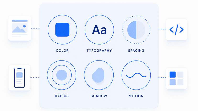
Source: Figma
Neumorphism as an aesthetic concept with limitations
Neumorphism emerged as a response to the long-standing dominance of flat design. It introduces subtle shadows, low contrast, and the impression that elements are either emerging from or embedded into the background. The result is a visually cohesive environment that feels calm and polished.
However, this approach runs into a fundamental issue. Interactive elements often blend into their surroundings, making their function unclear. Users must spend more effort identifying what is clickable and what is not. This slows down navigation and reduces confidence when interacting with the interface.
It becomes evident that neumorphism prioritizes aesthetics over functionality. And this is precisely where it conflicts with the demands of modern digital environments. Interfaces today need to be fast, readable, and unambiguous. Overly subtle contrast undermines these qualities.

Glassmorphism as layering and context
Glassmorphism is built on a different principle. Instead of simulating physical surfaces, it uses transparency, background blur, and layering. It creates the impression of glass-like panels that separate content without fully isolating it.
This approach allows the interface to retain visual context while still being structured. Users can distinguish what sits in the foreground and what remains in the background without losing orientation. The design feels lighter and more responsive to the dynamic nature of digital environments.
We believe that this ability to work with layers is the reason why glassmorphism has persisted longer than neumorphism. It does not act as a rigid style but rather as a flexible tool that can be combined with other design principles.

Limitations of both approaches
At first glance, glassmorphism may seem like a universal solution. However, it also has its risks. When overused, it can lead to reduced clarity and a breakdown of visual hierarchy. The interface may appear visually rich, but harder to navigate.
Neumorphism, on the other hand, struggles with insufficient contrast and accessibility. In an environment where inclusive design and broad usability are expected, these limitations become critical barriers.
Both styles ultimately point to the same conclusion. A visual trend alone is not enough. Without a clear structure and functional logic, it becomes more of an obstacle than a benefit.
Why neumorphism did not succeed
Neumorphism briefly emerged as a strong trend, but its adoption remained limited. The main reason lies in its difficulty to scale within complex interfaces, where multiple states, high readability, and clear navigation are required.
Low contrast makes it problematic across different lighting conditions and devices. At the same time, it has proven difficult to scale effectively. It may work in simple concepts, but it fails in more complex systems.
We believe that these limitations are why neumorphism never became part of broader design systems.
Glassmorphism as part of a design system
Glassmorphism, in contrast, has found its place in a more selective way. Not as a dominant visual language, but as a supporting element that helps structure hierarchy and separate content.
This approach aligns with how digital products are built today. Design is no longer an isolated output, but part of a broader system that must function consistently across multiple channels and devices.
BrandCloud enables teams to maintain consistency of these elements across an entire brand. This makes it possible to apply such visual principles in a controlled way, with a clear purpose rather than as a standalone effect.

Source: Medium
What to take away and how to apply it
If you work with UI design, the question is not which style to choose. The real question is what problem you are solving and which approach helps you achieve a clear and usable result.
Recommendations:
- Avoid using neumorphism for elements that need to be clearly interactive
- Apply glassmorphism where you need to separate layers without losing context
- Carefully control contrast and readability in all interface states
- Treat design as part of a system, not as an isolated visual style
- Test functionality, not just visual appeal
A common mistake is adopting a trend without understanding its limitations. This leads to solutions that may look modern, but fail over time.