Current digital design is undergoing a significant transformation. After years dominated by minimalist interfaces and perfectly polished aesthetics, a rawer and more authentic visual communication style is increasingly being embraced. It is precisely within this environment that brutalism is making a strong comeback.
A style that was still considered a niche experiment just a few years ago is now influencing the appearance of websites, digital products, and contemporary branding. It is also being increasingly recognized by Generation Z, which is growing up in an environment shaped by social media, algorithmically optimized content, and a visually uniform internet.
Brutalism emerged as a reaction to aesthetic uniformity
Today, brutalism is mostly associated with digital design or experimental websites, but its origins are much older. The movement emerged in architecture during the 1950s, and its name comes from the French expression béton brut, meaning raw concrete. Massive buildings, exposed structures, and an emphasis on raw materials became its defining characteristics.
Decorative elements and polished aesthetics dominating previous styles were rejected by brutalist architects. Buildings were intended to appear authentic, functional, and free from unnecessary ornamentation. This philosophy was later transferred into the digital environment.
In digital design, brutalism began appearing more prominently around 2014 as a reaction to the dominance of extremely clean minimalist UI. The internet gradually started to feel visually uniform. Similar layouts, identical typography, and nearly identical UX principles were being used across a large number of websites.
Instead of soft gradients and perfectly balanced grids, designers began working with sharp contrasts, asymmetry, oversized typography, or intentionally uncomfortable interfaces. The style often referenced the early internet of the late 1990s and early 2000s. At first glance, brutalism could appear unfinished or chaotic. In reality, however, it represented a very deliberate breaking of design rules.
Over time, this rawer aesthetic also started being adopted by fashion brands, creative studios, and experimental digital projects. Aggressive typography, stronger contrasts, and interfaces designed to create emotion or visual tension moved into the spotlight.
Generation Z is changing expectations around digital communication
Generation Z is still growing up in an environment shaped by social media, filters, and highly optimized digital content. As a result, communication that feels authentic, raw, and less controlled is often perceived more positively.
In this context, brutalism represents more than just a visual style. It expresses a certain attitude toward contemporary digital aesthetics. Overly polished branding is increasingly being perceived by younger audiences as artificial or untrustworthy.
Instead of perfectly unified visual systems, stronger individuality and a more distinctive brand character are becoming more appreciated. Authenticity, originality, and a certain degree of visual boldness are moving to the forefront.
This shift is also visible across the startup scene and within new digital products. Just a few years ago, technology brands were dominated by soft illustrations, pastel colors, and safe-looking UI systems. Today, harsher typography, stronger contrasts, and less conventional layouts are increasingly being used.
Perfection often limits brands today.
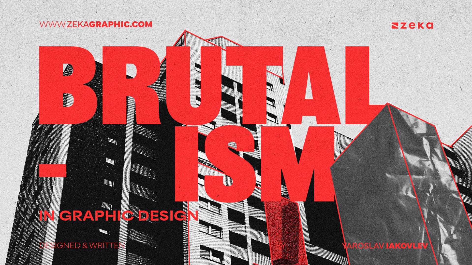
Source: Zeka Design
Neo-brutalism is reshaping modern digital products
Brutalism is becoming most prominent online. In social media environments and fast-paced content consumption, brands compete for only a few seconds of attention. And it is precisely here that sterile minimalism often begins to blend together.
Brutalist design is able to stop users through expressive typography, strong contrasts, or unexpected compositions. As a result, visual tension is created, supporting both brand memorability and the recognizability of digital products themselves.
At the same time, UX is not being abandoned. Modern brutalist websites are often highly sophisticated from a technical perspective, combining raw aesthetics with fast navigation and contemporary content structures.
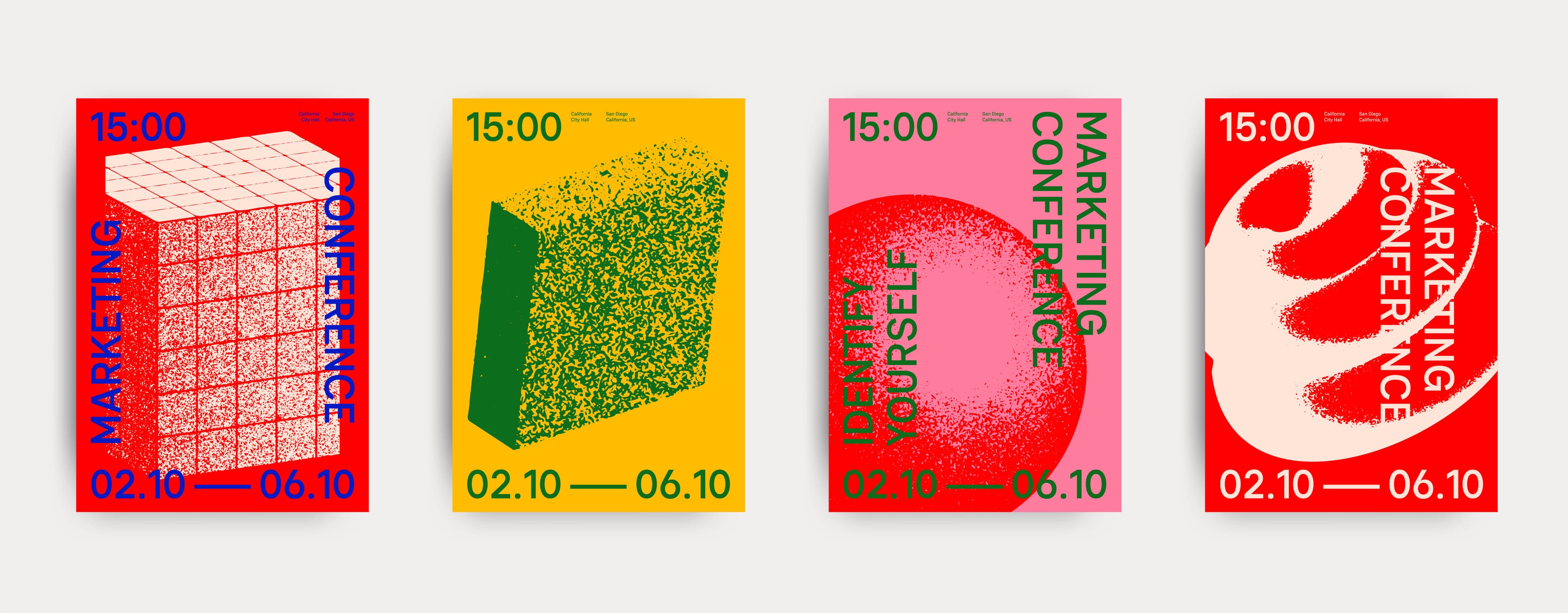
This approach gradually led to the rise of neo-brutalism. A style that combines strong visual identity with modern product design. Typical elements include hard shadows, thick outlines, oversized buttons, high-contrast typography, and bold color palettes.
Neo-brutalism is increasingly being adopted by new digital products, AI tools, and creative startups. The need to stand out from competitors and build a stronger brand identity continues to grow. While only a few years ago most startup websites looked almost identical, companies today are increasingly working with more distinctive aesthetics and less corporate communication styles.
What brands can take away from brutalism
Brutalism does not mean that every brand should immediately abandon minimalist design. What matters far more is understanding why this style is becoming relevant again.
The main focus today is increasingly placed on:
- stronger brand authenticity
- standing out from visually uniform environments
- bolder typography and stronger contrast
- less corporate communication
- stronger visual identity across digital channels
At the same time, the organization of digital assets and unified brand management are becoming increasingly important. When companies work with more expressive visual identities, inconsistent communication can emerge very quickly. BrandCloud allows teams to share brand manuals, design systems, and approved visual assets across departments, helping maintain a consistent brand character even within more experimental visual styles.
Brutalism is not chaos without rules
A common misconception is that brutalist design represents a complete rejection of UX or functionality. In reality, high-quality brutalism is often highly sophisticated. The main difference lies in the fact that it does not appear sterile.
This is precisely why many brands approach brutalist aesthetics more carefully today than in the past. The goal is no longer to create chaotic interfaces at any cost. Instead, the focus is on bringing stronger character back into digital communication.
As a result, the idea that professional design must always appear perfectly polished is gradually being abandoned. The internet is now filled with visually safe products that appear professional yet remain highly interchangeable.
Brutalism brings tension, authenticity, and greater visual boldness back into this environment. And that is exactly why it works so effectively today.