
A brand may have precisely defined typography, yet its visual identity can begin to fall apart as soon as it enters an international market. All it takes is translating its website into a language whose characters are not supported by the corporate font. The browser uses a fallback font, the proportions of the text change, and the individual language versions no longer look consistent.
Multilingual fonts help solve this problem. They include broader character sets and make it possible to use visually coordinated typography across different languages and writing systems.
So how can you choose a font for a multilingual website while maintaining a consistent brand identity?
What are multilingual fonts?
Every font contains a particular set of graphical characters known as glyphs. In addition to letters and numbers, these include diacritics, punctuation, symbols, ligatures, and special characters.
A standard font may support basic Latin characters but lack the characters required for Czech, Polish, Romanian, or Turkish. The differences become even greater when moving to Cyrillic, Greek, Arabic, Hebrew, or Chinese characters.
A multilingual font is designed to support multiple languages or writing systems. However, the extent of this support can vary considerably. The label “multilingual” does not in itself guarantee that the font includes all the characters required for particular markets.
Which fonts support multiple languages? This cannot be determined by appearance alone. The specific character set must always be checked.
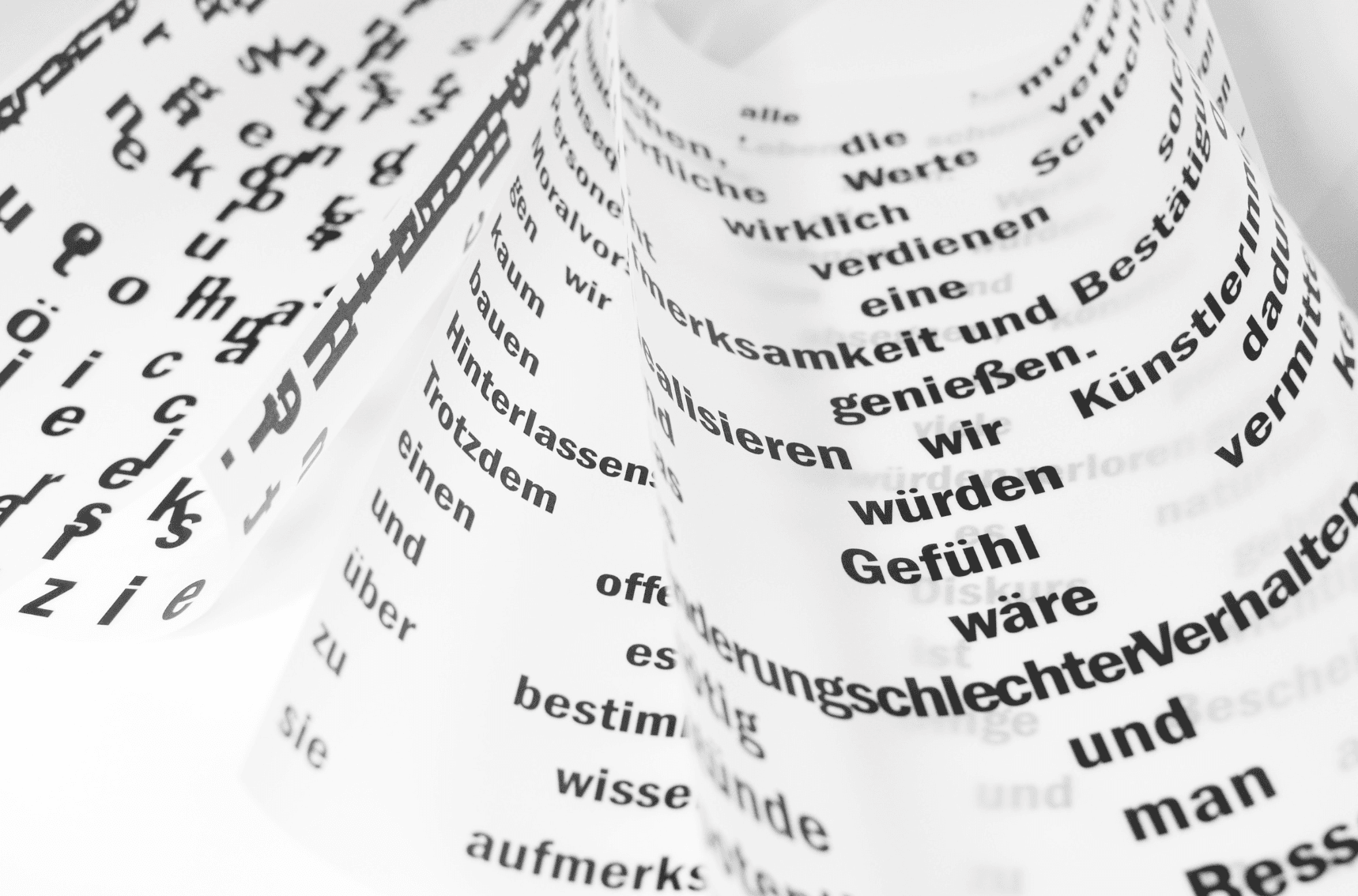
Why use multilingual fonts on the web?
If a font is missing a particular character, the application or browser will usually use a fallback font. In the worst case, it displays an empty rectangle commonly known as “tofu.”
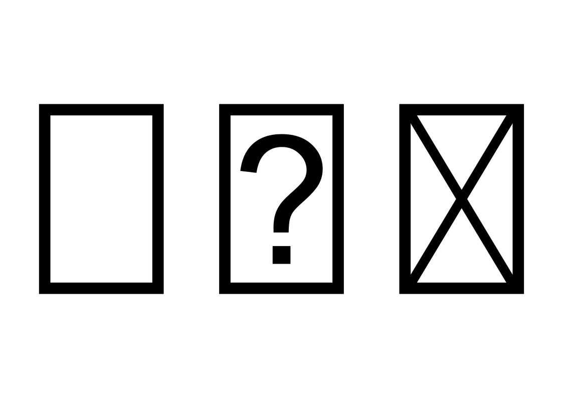
A fallback font may have a different height, width, weight, or spacing. This can affect the length of headings, line breaks, button layouts, and the overall hierarchy of the page. The translated content may be correct, but its visual presentation no longer reflects the brand identity.
Using multilingual fonts on the web supports:
- correct display of all characters,
- readability of translated content,
- a consistent appearance across language versions,
- a more stable page layout,
- consistent brand presentation.
Differences may also occur between styles and weights within the same font family. The regular style may contain the required characters, while the italic or bold version does not. The review must therefore cover the entire set used by the brand.
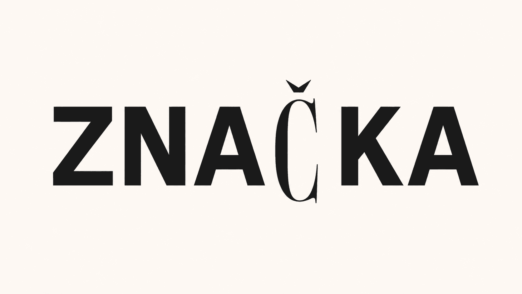
A consistent identity does not require identical shapes
Every writing system has its own structure, history, and typographic rules. Attempting to mechanically reproduce the appearance of Latin characters in Arabic or Japanese can reduce readability and feel culturally inappropriate.
A high-quality multilingual font family therefore does not create identical characters. Instead, it preserves shared visual characteristics, such as:
- similar stroke weight,
- comparable proportions and text density,
- a consistent rhythm,
- a corresponding level of contrast,
- a similar character and expression.
As a result, the individual language versions feel like part of the same brand, even though their shapes follow local typographic conventions.
A consistent identity does not mean that every language must look identical. What matters is preserving a shared typographic character.
How to choose multilingual fonts
The choice of a multilingual font should be based on the specific languages, markets, and communication channels involved. Evaluating only the appearance of the Latin character set is not enough.
When looking for a suitable font, you can also use Google Fonts, which offers typefaces with varying levels of language support. Before using a font, always verify that it contains all the required characters, styles, and weights.
Before implementation, check:
- Language coverage: Verify both current and planned languages.
- Character completeness: Check diacritics, punctuation, currency signs, and special symbols.
- Available styles and weights: Review regular, bold, italic, and any other required variants.
- Readability: Test headings, longer passages, and small font sizes.
- Writing direction: Some languages require right-to-left text.
- Technical formats: For web use, confirm the availability of WOFF or WOFF2 formats.
- File size: Extensive character sets can slow down page loading.
- Licensing: Verify permitted use on websites, in applications, and in printed materials.
How can you determine whether a font supports Czech or another language? The best approach is to test it with real text containing diacritics, numbers, and special characters. A single sample sentence may not reveal every missing character.
The font should also be tested directly within the website or application design. Translations may be longer than the original text and can affect button dimensions, navigation, or heading line breaks.
How to keep multilingual typography under control
Selecting the right font is only the beginning. Multilingual typography requires clear rules for using, sharing, and managing individual font files.
Brand guidelines should specify:
- approved fonts for individual languages,
- permitted styles, weights, and sizes,
- rules for typographic hierarchy,
- fallback fonts,
- rules for web and print use,
- licensing restrictions,
- responsibility for updates.
It is also important to define where the latest font files are stored. If individual teams or international offices choose their own alternatives, the brand’s typography may gradually become inconsistent.
BrandCloud makes it possible to centrally manage approved fonts together with licensing information, usage rules, and other brand materials. Internal teams and external partners can therefore work with the same files and know which version is intended for a particular language or market.
A consistent brand can speak multiple languages
Multilingual fonts are more than a technical solution for missing characters. They help preserve the character of a brand when its communication extends beyond a single language.
A well-designed typographic system respects the differences between writing systems while connecting them through a shared visual principle. A brand does not have to look identical in every language. However, it should still feel like the same brand.