Michelangelo’s manuscripts and works of art inspired the new Michelangelus typeface. Designed by Studiogusto, it is reaching a wider audience through a collaboration with Microsoft. It is already available to download and is scheduled to be added to Microsoft 365 applications at the end of 2026.
Its creation involved studying original letters and inscriptions carved into stone. The designers looked for shapes and proportions that would also work in today’s digital environment.
Why the typeface was created now
Michelangelus was created to mark the 400th anniversary of the consecration of St. Peter’s Basilica in the Vatican. It was commissioned by the Fabbrica di San Pietro, the institution responsible for caring for the basilica. Michelangelo himself is closely associated with the building, having designed its dome.
The new typeface is intended for printed and digital materials, as well as signage inside the basilica. Sharing it through Microsoft will make it available to people beyond the Vatican.
What was preserved from Michelangelo’s handwriting
The designers focused on the structure of the letters, their rhythm and the movement of the strokes. They studied original manuscripts in the Vatican archives. They examined how Michelangelo worked with shapes and spacing, and how individual letters related to one another.
Their main areas of focus were:
- the proportions and slant of the letters,
- the contrast between thicker and thinner strokes,
- the endings of individual strokes,
- spacing and overall legibility.
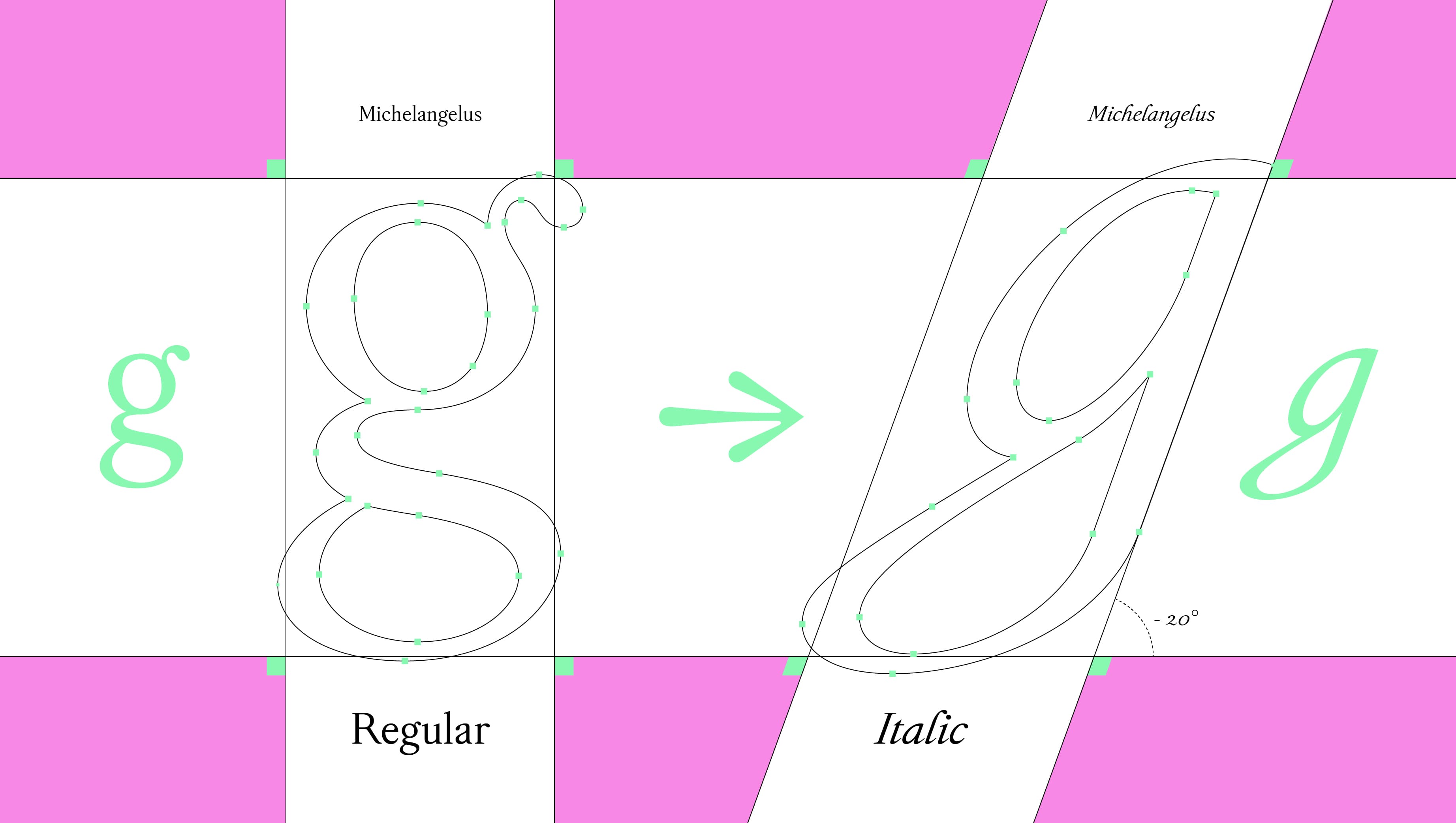
The italic style, with its slanted letterforms, was designed first. It is the closest to the handwritten originals. The upright forms and capital letters also draw on historical inscriptions.
However, the original materials did not contain all the necessary characters. Missing letters and numerals therefore had to be designed. Each new shape needed to remain consistent with the rest of the alphabet.
Source: Microsoft
What Michelangelus looks like
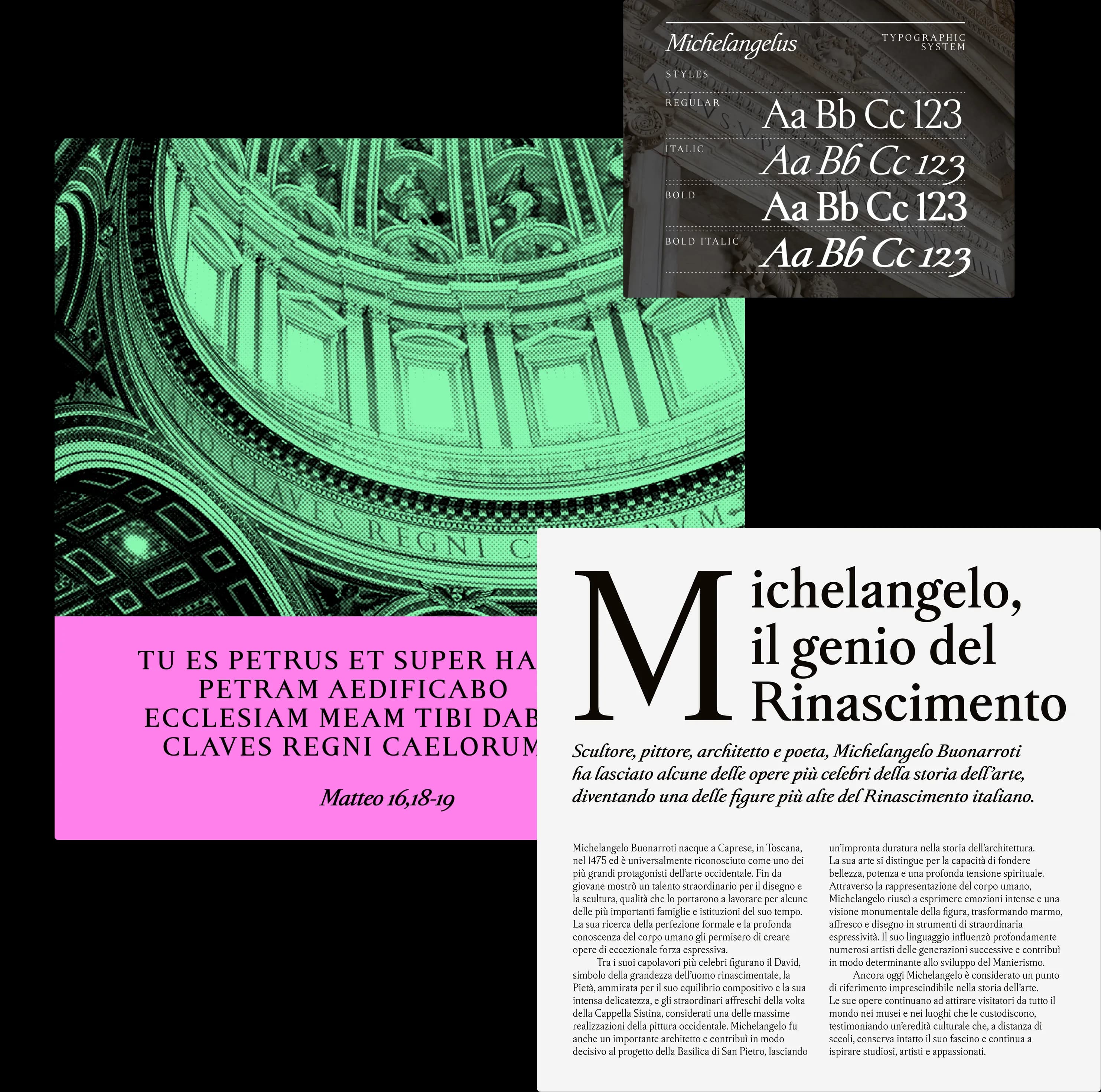
The result is a serif typeface designed for contemporary use. Serifs are small details at the ends of letter strokes. Michelangelus retains a visible influence of handwriting, particularly in its italic style.
Four styles are available:
- regular,
- italic,
- bold,
- bold italic.
Microsoft lists support for Central European Latin characters, which include Czech characters. The typeface can therefore also be used for Czech text.
Source: Microsoft
What to check before adding it to a visual identity
When choosing a typeface, legibility and consistency with the brand’s visual identity matter. Its historical origins can be an interesting part of its story. For everyday use, however, what matters is how easily it reads and how well it works within the overall design.
Before introducing it, it is worth:
- Checking legibility at the sizes you use.
- Checking Czech diacritics.
- Testing how it appears on screen and in print.
- Reviewing the licensing terms.
- Documenting rules for using each style.
BrandCloud helps keep typography guidelines and related assets in one place. This gives everyone working with the visual identity a clear understanding of which typeface to use and how to use it.
Historical sources become a new tool
Michelangelus combines the study of historical references with the demands placed on a contemporary typeface. Its final form reflects a series of decisions about what to preserve and what to adjust for better legibility.
That careful work gives the project its purpose. It brings Michelangelo’s legacy out of archival documents and into the texts being written today.