The same color combination can evoke nature, create a festive feel, or warn of danger. The overall impression also depends on the object it appears on and how that object is designed.
Color psychology helps explain why choosing shades alone is not enough. When creating a visual identity, it is important to consider the entire composition and the setting in which people will encounter it.
What color psychology explores
Color psychology examines how colors affect human experience and perception. Its findings are applied in design, advertising, and architecture.
Associations develop in different ways. Some colors recall familiar objects, such as brown suggesting soil or wood. Others draw on learned conventions and cultural traditions. This is why the meaning of colors cannot reliably be summarized in a chart that assigns a single emotion to each shade.
For a brand, a better starting point is to ask what its colors should communicate to a specific audience. Combinations that support the intended message should then be selected.

The meaning of colors changes depending on where they are used
The same color combination can evoke different associations in different situations. The objects, images, and text it accompanies help establish its meaning. Yellow and black provide a useful example.
- On warning signs, this combination signals potential danger. A symbol or text usually clarifies the message.
- On lemon tea packaging, yellow might reflect the pictured lemon, while black is used for the product name. Here, the combination helps communicate the flavor.
When choosing colors for a brand, it is therefore useful to assess the entire design together with its content. For yellow and black tea packaging, for example, it is worth checking whether customers associate it with lemon flavor or whether stripes and prominent symbols make it look more like a warning.
Red and green from a festive mood to contrasting meanings
Red and green can form a shared theme or signal opposite meanings. Paired with evergreen branches, they evoke Christmas. On traffic lights or phone screens, however, they indicate different options or states. The same pair can bring elements together in a festive composition or distinguish them from one another. Its use should therefore make clear whether the aim is to create a mood or help people understand the information.

Saturation and color proportions change the overall effect
A color’s name does not fully describe its appearance. Saturation refers to its intensity, while brightness relates to how light or dark it appears. The effect of a combination also changes according to the relative areas occupied by each color and the contrast between them.
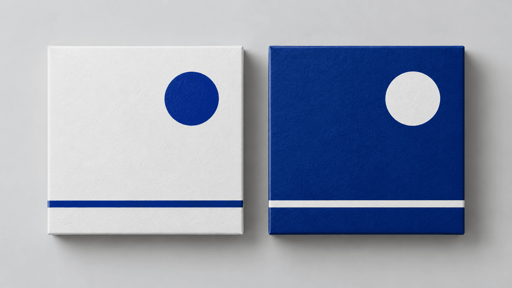
When designing a blue and white palette, it is therefore worth comparing two versions. One might feature mostly white with small blue details, while the other uses a dark blue background with white lettering. The colors are similar, but their roles in the composition are reversed.
This comparison is most useful when made directly on the intended material. A physical sample helps when designing packaging, while a full-page mockup is useful for a website. A standalone swatch cannot show every relationship between color and content.
How to apply color psychology when building a brand
A color palette should be evaluated according to what it communicates and how it works in different settings. Taking a systematic approach to its selection is worthwhile.
- Describe the intended impression. Instead of the general aim of “making it look good,” decide whether the design should explain something, draw attention, or create a festive feel.
- Compare different treatments. Try different color proportions, saturation levels, and backgrounds.
- Check how the colors work with the content. Assess them alongside photography, typography, and text.
- Ask your target audience. Find out what the design reminds them of and whether it conveys the intended message.
- Consider where it will be used. Prepare examples for packaging, websites, presentations, or retail spaces.
- Document the guidelines. Define approved combinations and illustrate them with specific examples.
A color palette needs usage guidelines
When managing a brand in BrandCloud, it is useful to prepare examples of color usage alongside the color values themselves. Each combination should include an explanation of which materials it is intended for, which color should dominate, and which backgrounds are suitable.
This gives both the team and external collaborators a reference for future designs. They can maintain a recognizable brand identity while adapting the composition to a specific purpose. An important part of working with colors is understanding what they communicate in a particular setting.